yeah take the white glow off the logo it really doesnt work well. maybe a black glow or drop shadow would suit it better because it doesnt look like it would stand alone too well on that background.
the box has a good composition though my only issue is that it's so monochromatic that everything blends together a little too much especially on the bottom half of the front. maybe throw in some red in some spots or some faint colors just to bring things out a little more. Other than that and a few minor quality issues and faded edges I think it's a great job and you have some good potential! Keep it up.
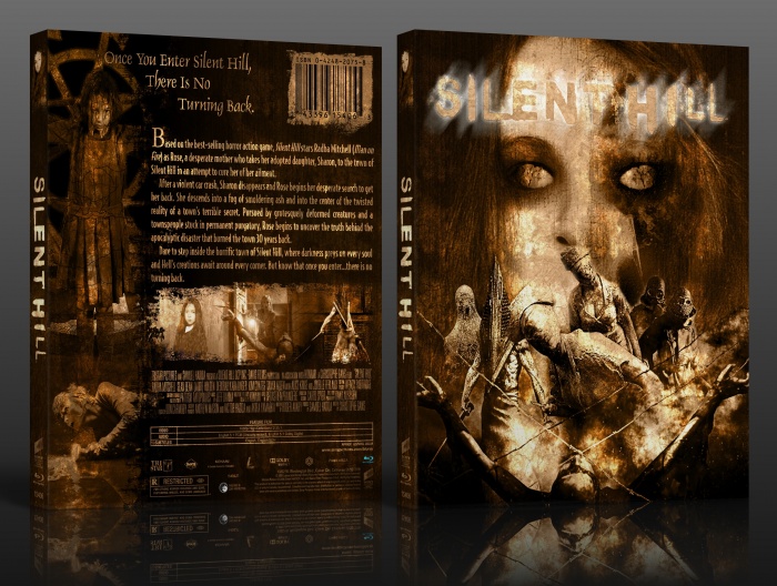
 Silent Hill Box Cover Comments
Very artistic.
[ Reply ]
Thanks for your kindness LastLight.
[ Reply ]
Not too fond of the lighting effects used to the front logo, but otherwise this is pretty great
[ Reply ]
Thanks rob.
[ Reply ]
Very nice.
[ Reply ]
Thanks.
[ Reply ]
Very nice !
[ Reply ]
Thanks.
[ Reply ]
Agree with Rob, about the logo. But overall, this box is really nicely put together. Really love the presence it holds.
[ Reply ]
Thanks.
[ Reply ]
yeah take the white glow off the logo it really doesnt work well. maybe a black glow or drop shadow would suit it better because it doesnt look like it would stand alone too well on that background.
the box has a good composition though my only issue is that it's so monochromatic that everything blends together a little too much especially on the bottom half of the front. maybe throw in some red in some spots or some faint colors just to bring things out a little more. Other than that and a few minor quality issues and faded edges I think it's a great job and you have some good potential! Keep it up.
[ Reply ]
Thanks For Comment.
[ Reply ]
When did you make this?
[ Reply ]
cover is stolen..
link
its shame
[ Reply ]