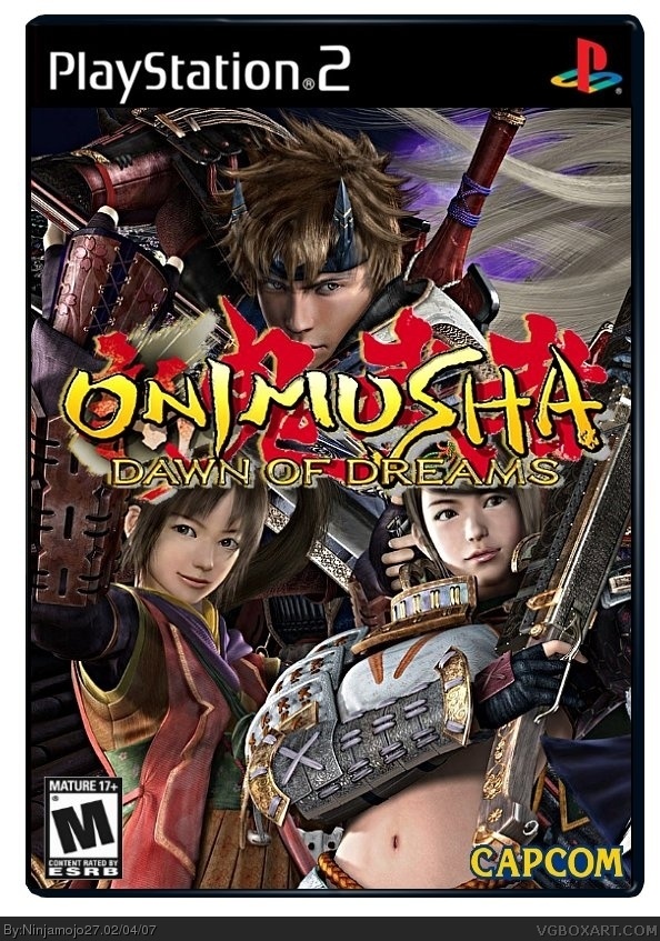
The logo isn't cut out too great, but everything else is great.
But a few problems:
1) I think the logo should be moved down underneath the girls' faces.
2) The Capcom logo is too tall
3) The ESRB is too flat.
I'd say about a 4/5 right now.
#4, I think I may keep the logo where it is because if I mive it down it will look bad. Also, I dont know how to cut that out anymore because that is how it is supposed to look. And I dont know what you mean by it is to flat.

 Onimusha: Dawn of Dreams Box Cover Comments
Well this is my newest box! Cred to geobon for the logo and Crayon Man for the temp. Enjoy!
[ Reply ]
Also, please view in full.
[ Reply ]
great!
[ Reply ]
The logo isn't cut out too great, but everything else is great.
But a few problems:
1) I think the logo should be moved down underneath the girls' faces.
2) The Capcom logo is too tall
3) The ESRB is too flat.
I'd say about a 4/5 right now.
[ Reply ]
#4, Ok ill fix those but what do you mean by to flat?
[ Reply ]
#4, I think I may keep the logo where it is because if I mive it down it will look bad. Also, I dont know how to cut that out anymore because that is how it is supposed to look. And I dont know what you mean by it is to flat.
[ Reply ]
The ESRB is too short, i guess I should say.
[ Reply ]
#7, That makes sense to me now thank you.
[ Reply ]
UPDATED- fixed ESRB and capcom logo.
[ Reply ]
So, does it look any better?
[ Reply ]
the characters all kinda blend in together. you should give them like glows/dropshadows or something.
[ Reply ]
#11, Ok ill try that and see if it looks better
[ Reply ]
I tried that but it doesnt do anything it still looks the same.
[ Reply ]
Is anyone gonna rate?
[ Reply ]
I likei it (:
[ Reply ]
Thank you.
[ Reply ]
awsome! and whees credit to me for helping u, i got it to look sharper!
[ Reply ]
wheres*
(sorry for the double post)
[ Reply ]
#18, Oh yeah, well it actually was your bro and I kind of knew that to. But fine credit to OK for sharpening the image.
[ Reply ]