Credit to Sens for plastic template, which I edited to resemble Blu-ray package. Hope you like it!
[ Box updated on September 28th, 2015 ] [ original ]
 The Dark Knight Rises Box Cover Comments
Comment on Indexenos's The Dark Knight Rises Box Art / Cover.
Nice Men
[ Reply ]
This is not your best.
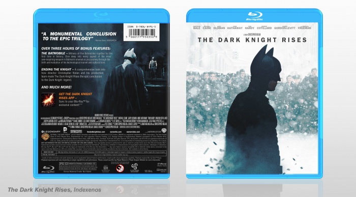
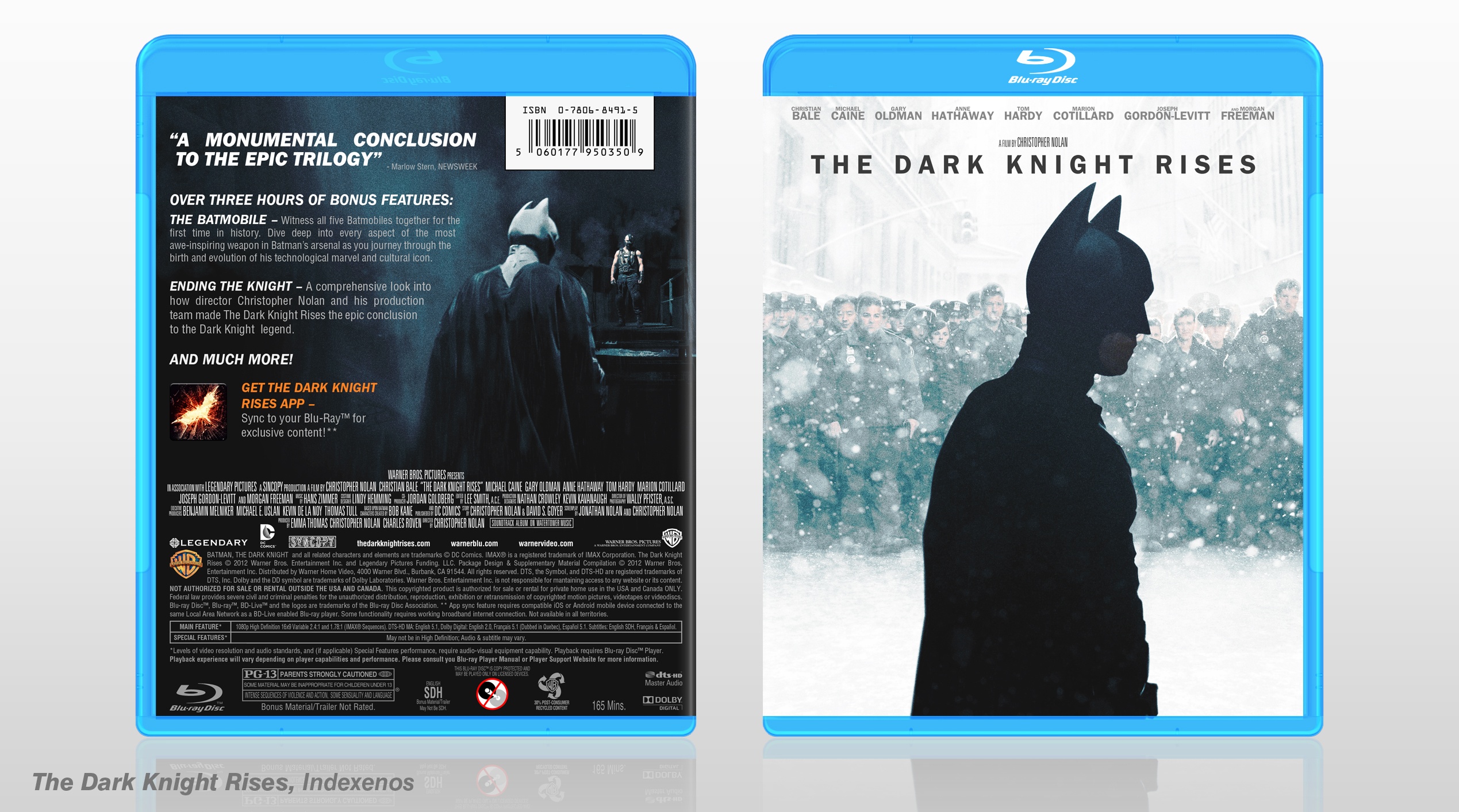
About the front I think Bruce on the front is not fitting with the background. I really like the background with snow theme idea, but I think you should do something with Bruce.
The other thing is I can't see any connection between front and back. Front is white with snow and back is just black. Otherwise I think back is good.
[ Reply ]
I really appreciate your feedback. I wanted front and back to be very differnent. Would you mind being more specific about the Batman issue?
[ Reply ]
@Indexenos I understand what you mean about the difference between front and back.
About the Batman, maybe replacing the render would help imo, or add some snow on the render (like the background).
[ Reply ]
@Sentinel Thank you I'll try to figure something out!
[ Reply ]
I love your trademarked cleanliness, but I don't like it much for a Batman box. It's well executed, don't get me wrong, I just don't feel like it fits.
[ Reply ]
Thanks! As you my know my first goal is cleanliness, especially when it's about movie covers ;)
[ Reply ]
Such a crisp design yet so gritty at the same time, i love it
[ Reply ]
Thank you!
[ Reply ]
The strong has a really silent feeling, which I extraordinarily love. The back is a big step in the wrong direction though, you should have kept that feeling. Because THAT front is pure silence, and I love it.
[ Reply ]
I meant the front has a silent feeling of course. Don't know what the strong is.
[ Reply ]
I agree. The front is very minimalistic (although it shows an important piece of the movie), so I felt the back had to contain another iconic scene. The issue you are pointing out comes from the fact i decided not to use the same art we see on TDKR posters and such. The pictures shown in this cover were hard (screenshots, press photos link ) to find and heavily edited.
[ Reply ]
please see inbox
[ Reply ]
My favourite artist on this site, period.
[ Reply ]
Thank you, this really made my day, man! It's great to hear from you again!
[ Reply ]
Very nice
[ Reply ]