#4, So KingdomGIMP thinks he has got an excuse to get away with pure simplicity,
but this game sure doesn't look special enough to have a special edition made for it.
Ever Zelda doesn't actually have a special edition planned.
Even though it's easy to look at, it has quite a few promblems. 3/5
Suggestions:
1. Since the front of the box has been used before in other Disaster boxes, try and be creative make it be "its own."
2. Honestly, making this Special Edition is just an excuse to shy away from more material to work with and etc, like said by EG. And if there's just not enough material for the game, then simply wait for some to become available, then dedicate yourself to making an authentic-looking box.
3. Now with some other issues:
- Nintendo logo on the front is too big.
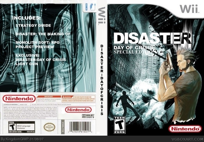
- The back of the box doesn't really resemble anything from the game, except the text that says "Disaster" in the features list.
- Plus, the font used for the back, and wherever else you added text, doesn't look very appealing and doesn't attract my attention.
- One more thing, the character on the front looks funny being cut-off by the waist, you could've maybe added a blur or something to not make that noticeable.
Sorry for singling you out, and I apologize, but a lot of newcomers and others need to learn that you need put TIME into your work. You can't just rush something out that you know doesn't look at its best. So just for a *NOTE* - Think about the way your box looks, does it appeal to YOU, and do you think it'll appeal to other people. And remember, BE CREATIVE.
All of you legit users on here have potential, use it... :)
 Disaster: Day of Crisis Box Cover Comments
Well, this is my newest Box Art. I hope you like it! :D
[ Reply ]
i saw this before o.O
[ Reply ]
BTW, this is my First Two-Sided Box Art! :D
[ Reply ]
Why does this have to be Special Edition?
[ Reply ]
#4, So KingdomGIMP thinks he has got an excuse to get away with pure simplicity,
but this game sure doesn't look special enough to have a special edition made for it.
Ever Zelda doesn't actually have a special edition planned.
[ Reply ]
#5, *even.
[ Reply ]
Well anyway, about the box...
Even though it's easy to look at, it has quite a few promblems. 3/5
Suggestions:
1. Since the front of the box has been used before in other Disaster boxes, try and be creative make it be "its own."
2. Honestly, making this Special Edition is just an excuse to shy away from more material to work with and etc, like said by EG. And if there's just not enough material for the game, then simply wait for some to become available, then dedicate yourself to making an authentic-looking box.
3. Now with some other issues:
- Nintendo logo on the front is too big.
- The back of the box doesn't really resemble anything from the game, except the text that says "Disaster" in the features list.
- Plus, the font used for the back, and wherever else you added text, doesn't look very appealing and doesn't attract my attention.
- One more thing, the character on the front looks funny being cut-off by the waist, you could've maybe added a blur or something to not make that noticeable.
Sorry for singling you out, and I apologize, but a lot of newcomers and others need to learn that you need put TIME into your work. You can't just rush something out that you know doesn't look at its best. So just for a *NOTE* - Think about the way your box looks, does it appeal to YOU, and do you think it'll appeal to other people. And remember, BE CREATIVE.
All of you legit users on here have potential, use it... :)
[ Reply ]
#7, Excellently put.
[ Reply ]
that artwork is strating to annoy me.
[ Reply ]
Awesome but the back sucks nothing really special and I wish they released screenshots for this game by now
[ Reply ]