#5, sorry bout the double post :(
You're very true about clutterdness isn't always bad but in this case its not good plus the fading is messing witht the back template. 3.5/5
#7, umm.. its not blurry at all...
if your using internet explorer 7, zoom in 125%, thats the best view. (note thats best view for most of my boxes)
#8, i dont actually see how it being clutterred disrupts the box itself. you can read all the text fine and i dont know what you mean exactly how its "cluttered". sure, theres alot of stuff, but i think that it makes it more interesting and full. i mean, i put alot of time in this one too... and teh back template is purposely faded because i used the god of war bottom, and it didnt go perfectly so i faded it.
i mean not to be ignorant, i do understand your criticism, but i think that your score is unfair.
#10, well is there a zoom function? because alot of images look pixelated or blurry unless you look at it at just the right zoom.
oh and AOL sucks. the browsers alright, but i prefer IE. th new internet explorer 7 is pretty much just like AOL browser :D, with tabs, and zoom. and easy access buttons. yup. mozilla firefox is cool too.
This is quality, not seriously badly cluttered but
flows with goodness and effort.
Only mistakes you made were having the PS2 logos on the back ( WG1 beat me up when I did that and he's right) and I'm not a fan of a bit of text on screenshots and there's a PAL logo on the spine even though this isn't European with the American ratings and other stuff like that, nothing too bothersome though.
So 4.5/5.
 Heavenly Sword Box Cover Comments
i hope you like it.
i tried my hardest to make something that you havent already seen yet.
even though i know i cant beat wicked's beastly box... ;)
[ Reply ]
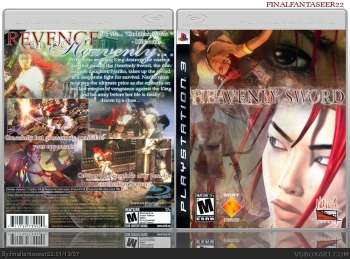
Its very very cluttered thats all I can say right now
[ Reply ]
#2,
[ Reply ]
#2,
[ Reply ]
#2, be that way.
clutteredness isnt neccessarily bad...
[ Reply ]
#5,
[ Reply ]
It kinda has a little too much action going on and the ESRB on the back is bit blurry .
Great job 4/5
[ Reply ]
#5, sorry bout the double post :(
You're very true about clutterdness isn't always bad but in this case its not good plus the fading is messing witht the back template. 3.5/5
[ Reply ]
#7, umm.. its not blurry at all...
if your using internet explorer 7, zoom in 125%, thats the best view. (note thats best view for most of my boxes)
#8, i dont actually see how it being clutterred disrupts the box itself. you can read all the text fine and i dont know what you mean exactly how its "cluttered". sure, theres alot of stuff, but i think that it makes it more interesting and full. i mean, i put alot of time in this one too... and teh back template is purposely faded because i used the god of war bottom, and it didnt go perfectly so i faded it.
i mean not to be ignorant, i do understand your criticism, but i think that your score is unfair.
[ Reply ]
#7 I'm useing AOL not internet explorer .
[ Reply ]
#10, well is there a zoom function? because alot of images look pixelated or blurry unless you look at it at just the right zoom.
oh and AOL sucks. the browsers alright, but i prefer IE. th new internet explorer 7 is pretty much just like AOL browser :D, with tabs, and zoom. and easy access buttons. yup. mozilla firefox is cool too.
[ Reply ]
This is quality, not seriously badly cluttered but
flows with goodness and effort.
Only mistakes you made were having the PS2 logos on the back ( WG1 beat me up when I did that and he's right) and I'm not a fan of a bit of text on screenshots and there's a PAL logo on the spine even though this isn't European with the American ratings and other stuff like that, nothing too bothersome though.
So 4.5/5.
[ Reply ]
#12, thanks EG
[ Reply ]
update: all 3d and stuff.
[ Reply ]
It great but the lower back is wrong.
4.5/5
[ Reply ]
#15, i kinda fixed it i think
[ Reply ]
#16, I didn't see that .
[ Reply ]
#17, version 3 i replaced the old ps2 info boxes with the ps3 ones.
[ Reply ]
template credit to hellkinght!
[ Reply ]
I like it. 5/5.
[ Reply ]