See it in full view for a for a better experience.
[ Box updated on August 3rd, 2013 ] [ original ]
 Risen 2: Dark Waters Collector's Edition Box Cover Comments
Comment on White Wolf's Risen 2: Dark Waters Collector's Edition Box Art / Cover.
Why thank you , Sir, a German Game.
[ Reply ]
My favourite game ever. :)
[ Reply ]
@White Wolf
Actually i haven't Played it yet. I Played the First game, Risen. If you like Risen, you should try Out gothic 2 .. That is awesome.
And the Whole Lot of Text on the back fits to the Design of a typical German Game :P
[ Reply ]
@aldimon Actually never Gothic, not even one. Don't know why but i endend up never trying them out. But i will one day. :)
About typical lot of text, i didnt knew about that, well, i guess luck is on my side then. :)
[ Reply ]
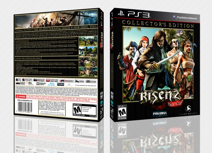
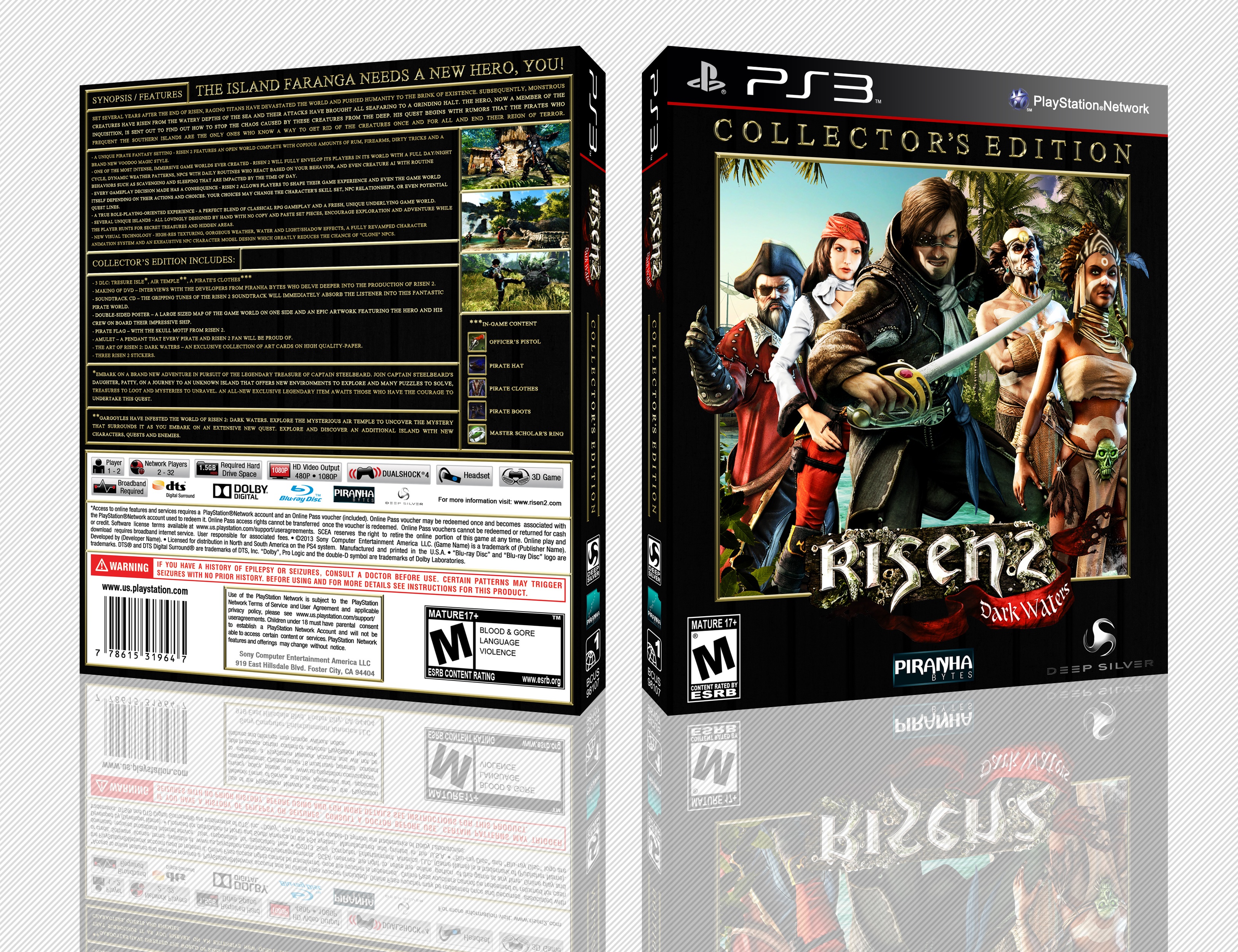
I first thought there was too much text on the back, and that it lacked colors, but I actually like it that way, surprisingly enough! Good job ;)
[ Reply ]
Holy text that back!
[ Reply ]
My thoughts lol
[ Reply ]
@Rarity It's that in a good way or a bad way ?
[ Reply ]
@White Wolf I think it is way to text crowded there, slightly bigger size maybe, it looks like a movie
[ Reply ]
I went for a complete back, but i think it look's nice because everything it's well organized.
[ Reply ]
Front is great but the back is waaaay to much text, minimise the text and add some pictures, and i personally would invert the white legal section down the bottom of the back so it's black, but that might just be me
[ Reply ]
I thought about that, i really did, but it doesnt look good and since it is legal info it should stand out imo.
[ Reply ]
@White Wolf The only thing i can cut out it's the synopsis from the DLC at the bottom, but that way i'll kill the "complete info" about the collector's edition. I'll see what i can do about it, when i can.
[ Reply ]
very good style, and very nice idea. but back of this cover is very cool and is full of Writing. You could use lots of images in back.
front really is very good. I like it.
[ Reply ]
Front Very Nice,But Back Accumulated From The Text , Like Front . . .
[ Reply ]
I really like the choice of gold text and the overall composition of the box. Echoing the others, the back has way too much text. Usually the manual covers a majority of the information you have on the back. I can understand wanting to display the information, but most people would take one glance and turn the other way due to the amount of text.
If you want to keep the text, you could also consider breaking it down into columns (maybe 3 columns in total, including the picture column) and avoiding all caps. You can make it a lot easier on the view to actually want to read through the text, because as it is in general rule of thumb when it comes sentences, the width of lines tend to make or break a viewer's decision to actually read and when letters are all capitalized when it comes to larger amount of information, it takes the human brain longer to actually digest and read it.
[ Reply ]
Wow . very nice Front .
[ Reply ]
I've UPDATED the box, i hope the back look's much better now. :)
[ Reply ]
Thanks Brother,Really Better Back . . .
[ Reply ]