The thing I don't like about this is that the two pictures were barely edited. Structurally, it's fine, but it's really just two pictures together with text slapped on.
As mentioned by Ergo, I would have really loved to see you play around with the brightness/contrast and/or colors of the images more. As for the layout and composition, it really is very nicely put together.
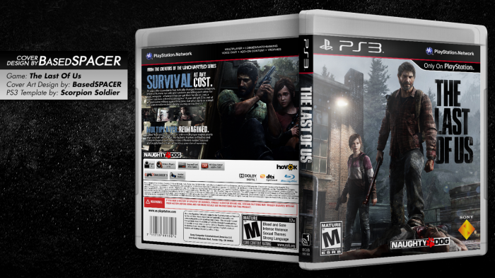
 The Last of Us Box Cover Comments
The thing I don't like about this is that the two pictures were barely edited. Structurally, it's fine, but it's really just two pictures together with text slapped on.
[ Reply ]
Aiming for the official look. That's what screws me most times. But thanks :)
[ Reply ]
It looks very official, Good Job :)
[ Reply ]
As mentioned by Ergo, I would have really loved to see you play around with the brightness/contrast and/or colors of the images more. As for the layout and composition, it really is very nicely put together.
[ Reply ]
I'm new to this, so maybe Ergo is right. But it does look official and I think it looks great, fav'd. Care to share a printable? :)
[ Reply ]