![]() »
»
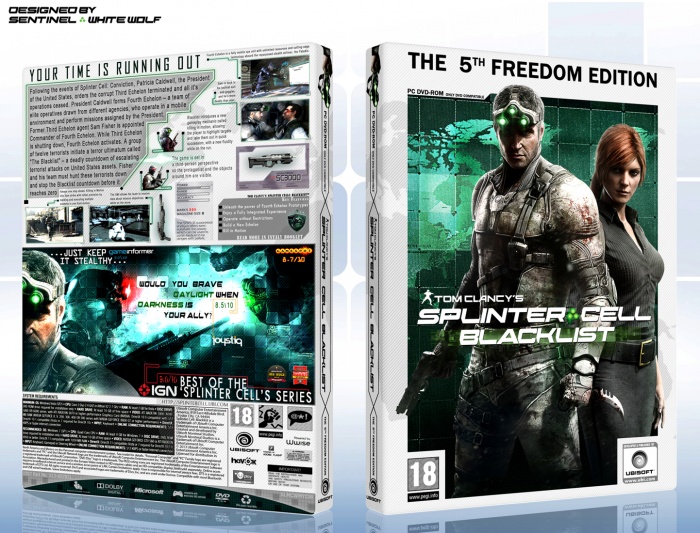
This is a collaboration between me and a great designer: "White Wolf"
I did the back and He did the front. I'm really happy from the result. We'll be happy to read your critiques.
 Splinter Cell: Blacklist Box Cover Comments
Comment on Sentinel's Splinter Cell: Blacklist Box Art / Cover.
Fantastic job to the both of you. :)
[ Reply ]
Back looks awesome.
[ Reply ]
I swear, if Majidblack posted this, it would have been in the Hall of Fame already.
[ Reply ]
hmm...
[ Reply ]
Well it definately looks like a majidblack design, in a good way. good job guys :)
[ Reply ]
Thanks.
[ Reply ]
Very nice guys! I hope you'll get this into HOF, it really deserves it.
[ Reply ]
Appreciated.
[ Reply ]
This is really nice job and i love it
only thing is on the back typo to close to the edge of cover, will be nice if make some space for it :D
[ Reply ]
Thanks. I'll do that in my next box.
[ Reply ]
This deserves HOF so much.
[ Reply ]
Thanks.
[ Reply ]
I like it. The only thing I could say is swap the image on the back above the info maybe?
[ Reply ]
That has to be one of the best Splinter Cell boxes around here. +fav
[ Reply ]
This is just shear perfection really. I mean the only thing I woulda done is centered Sam and the chick in the middle but really its not a big deal
[ Reply ]
Holy crap, this is great. Only a certain amount of boxes seem to be able to keep the design flowing from the front to the back and you've both done it perfectly. Not only that, and its a small thing i know, but you've actually filled out the legal info on the back. So many people don't do that and it just drives me nuts. Excellent attention to detail! Also looks great in full view too.
The only small thing i' can see is what SilentMan said, the characters on the front could be centered, but thats really an ocd thing from my pov and doesn't detract from the overall design at all.
Otherwise, great job guys, i'm sorry i missed this.
[ Reply ]
C'Mon HOF :D You can do it!
[ Reply ]
Hard to believe this is your first box. Just saw it. Hard to believe it xD
[ Reply ]
The front looks really quite amazing. The back is a bit overcrowded for my tastes but I can see why other people would like it though. I really love the idea on the back of those green lines with the dots on them (I have no idea what they are called haha but they are really visually quite cool). My only thing is I really wish that bright colour was consistant over the front and back, so like, either if you both used green or both used blue? I don't know. But it's definitely a high quality box you have here. :)
[ Reply ]
Well deserved hall of fame, I love it sentinel. :)
[ Reply ]
And white wolf :)
[ Reply ]
Hmm, I reckon that the back would be so much better if you changed the font you used for the main text on the back. Also, I think the information on the SPAS-12 would be difficult to read if printed so that should ideally be a bit larger.
Otherwise, the composition is really nice and it does deserve recognition.
[ Reply ]
Yeah! :)
We made it into HOF, Sentinel. :)
[ Reply ]
It's a good box! I just think the back it's overcrowded. The screenshot idea is great, although they are supposed to be larger.. You could reduce the amount of text (too many taglines and quotations are scattered) and use a lager font as well. I hope my comment can help ;)
[ Reply ]
This box has a lot of content on it.
The front is really well made, I feel the arrangement is very harmonic and awesome.
The back has a LOT of text, I don't like it, but the arrangement of the screenshots and that big image is really well done.
I don't know about this game so I'm not sure the choose of the gray color was great but it seems like a real piece of art.
No surprise, after all. It got Hall of Fame!
Cheers!
[ Reply ]
This is really cool
[ Reply ]
This is amazing! I love it :) +fav
[ Reply ]
Looks great! And this is a first? Impressive.
[ Reply ]
nice . please printable
[ Reply ]
Spellbound!
[ Reply ]
It's Great!
[ Reply ]
Printable please!
[ Reply ]
The box looks awesome, great job.
[ Reply ]
this box is so much looke like Majidblacks covers!!!!!!!!
SO MUCH...
[ Reply ]