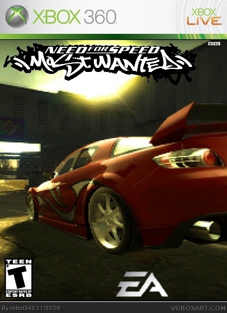
YAY!!!Another box and i think its totaly awsome compared to my toher ones and the logo came out much better then i thought. it may be a little bad but i think ive done well. If you vote please comment on what is wrong, and what is good also. Enjoy what i present to you.
i got it cut out like that sorry
i cant seem to use select by color myself though. Well anyways i thought u would bring vote up to at least 3.5 or 4, but i guess not :(
Well if it is a huge improvement, im fine with it anyways!
Oh and also why dont people very vote or comment on my boxes?it seems as though they wont ever comment or vote any of my boxes cuz i started out bad.please tell me what they have been telling everybody else if you have any information about it. and anyways please raise my score up cuz i fixed it. Thanks Ratchetcomand!
who rater it a 1 or 2!!!!COMMENT WHY!!!!!!!!!!!!!!!!!!!!!SHEESH I HATE ALL YOU PEOPLE THAT DONT COMMENT ON YOUR VOTE!SHEESH IS THAT TOO MUCH TO ASK!!!!!!!!GOD!
The logo's supposed to look like that, I'd just center it more. Also, try to use bigger pics. This isn't as blurry as your others, but it's a huge improvement. 3/5

 Need For Speed: Most Wanted Box Cover Comments
YAY!!!Another box and i think its totaly awsome compared to my toher ones and the logo came out much better then i thought. it may be a little bad but i think ive done well. If you vote please comment on what is wrong, and what is good also. Enjoy what i present to you.
[ Reply ]
This is huge improvement
Suggestions:
1. Remove the white line
2. The image is very burry
3/5
[ Reply ]
Update!little less blurry, and no more white line.
[ Reply ]
It better but the logo looks badly cut out .
[ Reply ]
i got it cut out like that sorry
i cant seem to use select by color myself though. Well anyways i thought u would bring vote up to at least 3.5 or 4, but i guess not :(
Well if it is a huge improvement, im fine with it anyways!
[ Reply ]
Oh and also why dont people very vote or comment on my boxes?it seems as though they wont ever comment or vote any of my boxes cuz i started out bad.please tell me what they have been telling everybody else if you have any information about it. and anyways please raise my score up cuz i fixed it. Thanks Ratchetcomand!
[ Reply ]
who rater it a 1 or 2!!!!COMMENT WHY!!!!!!!!!!!!!!!!!!!!!SHEESH I HATE ALL YOU PEOPLE THAT DONT COMMENT ON YOUR VOTE!SHEESH IS THAT TOO MUCH TO ASK!!!!!!!!GOD!
[ Reply ]
Hello im new!but i think this is good compared to your other boxes but i think u cud do wit a lil less blur dude.4/5
[ Reply ]
Oh and settle down dud. They dun have to listen to everything you say, but dud seriously take a chill pill!!! and is sheesh even a wurd???
[ Reply ]
^_^ Nice box! 4/5 for the whole blurry thing. And 34, no offence, but it seems fine to me...o_O
[ Reply ]
**#4
[ Reply ]
**#4
[ Reply ]
...oops
[ Reply ]
The logo's supposed to look like that, I'd just center it more. Also, try to use bigger pics. This isn't as blurry as your others, but it's a huge improvement. 3/5
[ Reply ]
You have improved a lot. 3.5 stars man. Keep it up.
[ Reply ]