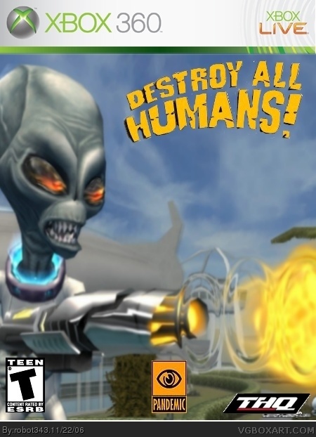
Please say this is at least a little bit better than my other ones, and the logo may be a tiny bit messed up because it wont let me use select by color, and I cant find out why!!! Please comment before you vote also!
maybe the pandemic logo could be on the right so it doesn't look wrong in the middle and the THQ in the bottom center. other than that (and the blurriness) it's decent, although it could be greatly improved.

 Destroy All Humans Box Cover Comments
Please say this is at least a little bit better than my other ones, and the logo may be a tiny bit messed up because it wont let me use select by color, and I cant find out why!!! Please comment before you vote also!
[ Reply ]
hmmm.... not so sure.
maybe the pandemic logo could be on the right so it doesn't look wrong in the middle and the THQ in the bottom center. other than that (and the blurriness) it's decent, although it could be greatly improved.
3/5 for now
[ Reply ]
Updated!no more white line on the bottem now!
[ Reply ]
kk ill update and shapren after more comments on what to do
[ Reply ]
Picture is way too blurry, and its just a wallpaper nothing special, but its slightly better.
2/5
[ Reply ]
maybe put an "only on xbox 360" logo to piss off ps3 users
[ Reply ]