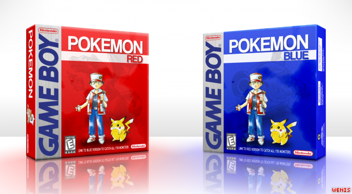
A bit plain, but I actually like it. One of the boxes should have a different character, for sure.
Still, artwork is on par with boxes of the era.
...
I kept starring at those boxes for a while and yes, I do like them.
In my opinion, it would have been cool if you added Blue on the front of the Blue version link, or at least chosen a different artwork of Red as the focal point. It's not a bad box, however I don't like the logo. If it were me, I'd a more eye-catching font, with a bright colour, because essentially, that's what Pokemon does at a design stand point. I really like the colour scheme, but it doesn't really pop out enough. Regardless, it's a really nice design, and I like it. And HOLY SHIT how did you do the 3D presentation so well?
I actually originally had Blue on the front of the blue version, but since you technically play as Red in both versions I just put Red on both. And for the 3D presentation, all I really did was highlighted the edges and added some black blur for the shadows
 Pokemon Red and Blue Box Cover Comments
A bit plain, but I actually like it. One of the boxes should have a different character, for sure.
Still, artwork is on par with boxes of the era.
...
I kept starring at those boxes for a while and yes, I do like them.
[ Reply ]
You nailed it. Exactly my opinion xD
[ Reply ]
In my opinion, it would have been cool if you added Blue on the front of the Blue version link, or at least chosen a different artwork of Red as the focal point. It's not a bad box, however I don't like the logo. If it were me, I'd a more eye-catching font, with a bright colour, because essentially, that's what Pokemon does at a design stand point. I really like the colour scheme, but it doesn't really pop out enough. Regardless, it's a really nice design, and I like it. And HOLY SHIT how did you do the 3D presentation so well?
[ Reply ]
I actually originally had Blue on the front of the blue version, but since you technically play as Red in both versions I just put Red on both. And for the 3D presentation, all I really did was highlighted the edges and added some black blur for the shadows
[ Reply ]
@Wenis Nice. Yeah, I got you about Red. I just feel it kind of repetitive using the same art, you know?
[ Reply ]
Not bad.
[ Reply ]