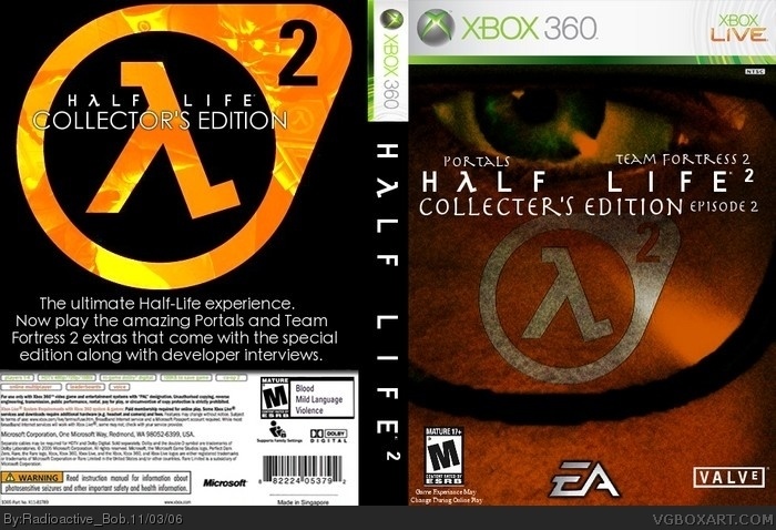
[ Box updated on November 3rd, 2006 ] [ original ]
 Half-Life 2 Collector's Edition Box Cover Comments
Comment on Radioactive Bob's Half-Life 2 Collector's Edition Box Art / Cover.
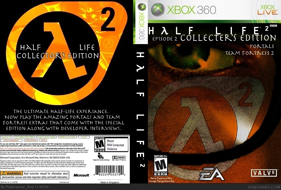
[ Box updated on November 3rd, 2006 ] [ original ]
Comment on Radioactive Bob's Half-Life 2 Collector's Edition Box Art / Cover.
My last few boxes defintely haven't been my best. I hope everybody likes this one. I wanted it simple to make it feel more like a collectors edition box. Well, i hope you like it. :)
[ Reply ]
Experience is spelled wrong. The font you used... doesnt look normal. Not fitting in with the rest of the box.
[ Reply ]
#2, ok, so my spelling isn't the greatest on a keybord, but the font, i like it :P
i didn't want it to be too simple, but i'll see if anything else looks better.
[ Reply ]
#3, correction your spelling isn't too good period lol. anyway it looks great but the back could use a little more to it i dont know what though. 4/5
[ Reply ]
#4, thanx but "back could use a little more to it i dont know what though" doesn't help one bit. You can't say something is bad and not have a reason. more text? replace the black? change the pic within the logo?
but thanx for the score. and no, my spelling is just bad on a keyboard becasuse my fingers slip and hit the wrong letters.
[ Reply ]
sorry but its a bit of a mess...looks like everythings just been thrown on with layout consired
[ Reply ]
#6 are u flipping kidding me this box is great...you should be ashamed.
4.5/5
[ Reply ]
#7, Why should Markybee be ashamed for having a point of view? look on his boxes, he knows what he is talking about.
He had a point even if his words were pretty harsh.
The text 'Team Fotress 2' so on could be spread more and less cluttered.
The 'Spiraly' font does'nt suit HL.
I know Bob did'nt want the text too simple but not too stylish for the simplicity of the box but he could've used a simple font with nice effects like link
I think there's some pretty cool imagery but it could be much better 3.5/5.
[ Reply ]
I like it becusce it has a drak feel to it .
It not you best but not your worst .
4.5/5
[ Reply ]
thanx for the comments. i will go back and change the text i suppose and the spelling error.
[ Reply ]
thanx for the comments. i will go back and change the text i suppose and the spelling error.
[ Reply ]
Update! i changed the text, except for the font on the front, i think it worls there. But for the back it's new text, also, you'll notice i have changed the size of the HL2 logo on the front. It seemed way to big before and felt like over-kill. with that in mind. I hope you like it.
[ Reply ]
#8 I know markybee is a good box artist in fact is a great box artists I just think that this box is very well made, Im not hatein on anybody Im just confused.
[ Reply ]
#13 no offense taken...every body is entitled to there opinion...thats kind of the point of this site...its just im a professional graphic designer and sometimes I see things that just look wrong to me...maybe I should stop comenting because I think my comments can comments can come across as patronising and thats not my intention
[ Reply ]
#14, you should keep posting. If you are profesinal (sp?) it would help me and other peeople.
[ Reply ]