Here is my entry for Kickstart 2013
I started this one a long time ago (even though this game is not coming out soon) and Kickstart gave me motivation to finish it.
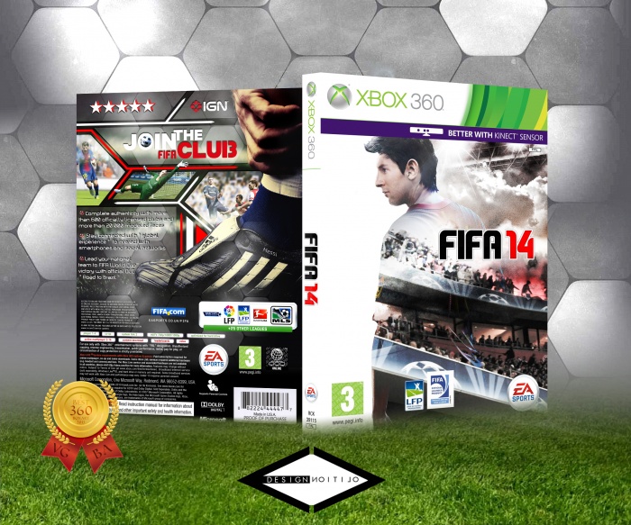
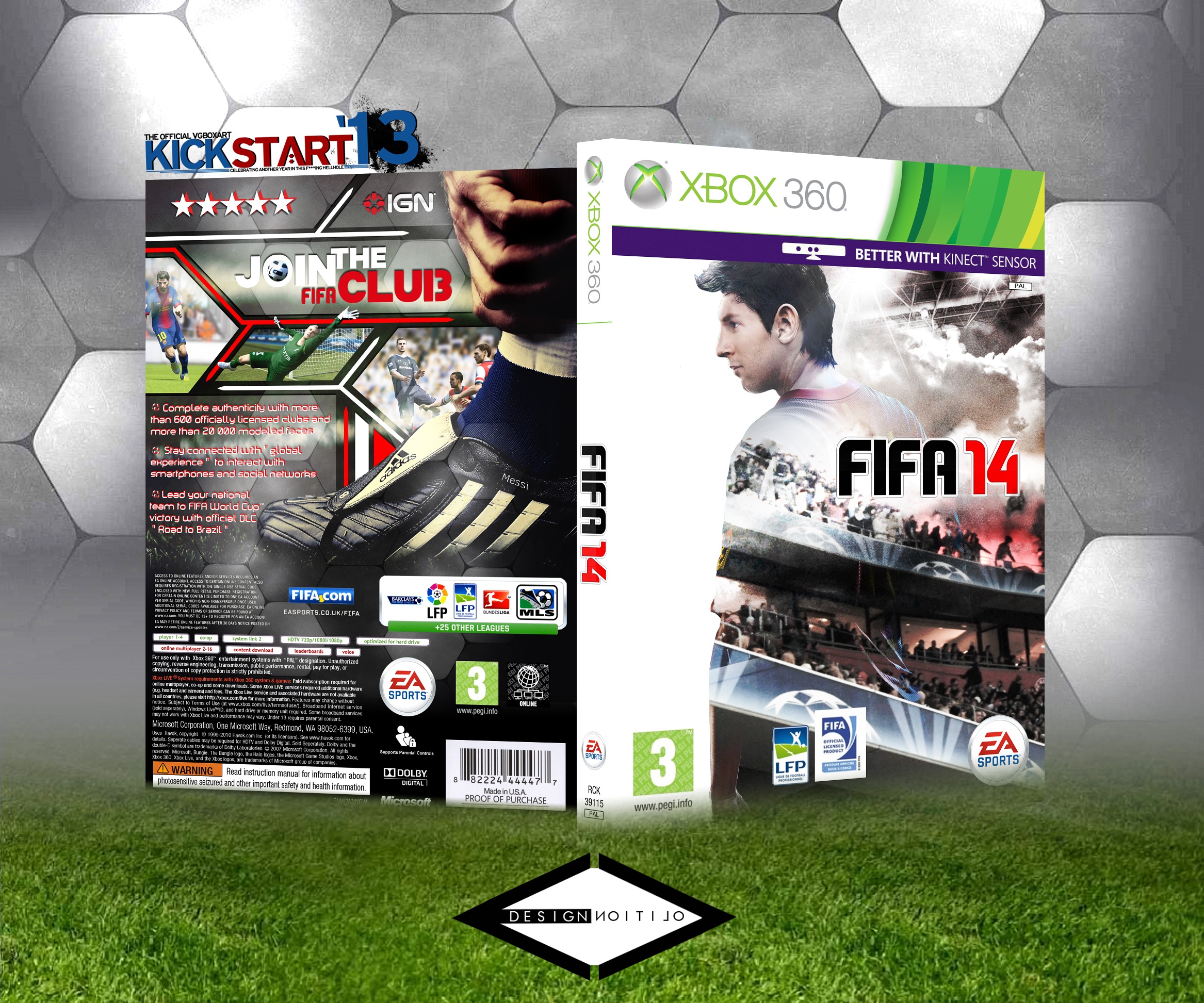
I tried to give a professionneal look to this but, as always, to make it original compared to EA's boring design, and I'm proud of what came out, hope you'll like it too.
Of course comments (and favs) are appreciated
[ Box updated on February 17th, 2013 ] [ original ]
 FIFA 14 Box Cover Comments
Comment on E-Volition's FIFA 14 Box Art / Cover.
It's better than most sports boxes (including official ones).
[ Reply ]
Well thanks, very appreciated to read it
[ Reply ]
The styles of the front and back don't really match much. I love the front though! If you can make a matching back to go with it that'd be sweet.
[ Reply ]
Actually I did it on purpose, I wanted the back to chop (Not sure if it's the right word) with the front
Thanks anyway
[ Reply ]
Yeah E-Vol ! Ca serait aux jaquettes FIFA je vois ! ^^
J'adore franchement ! Plus le back que l'avant par contre, mais je dois avouer l'originalité ! Le back envoie du lourd ;) Je suis un peu moins fan de l'avant, je reconnais que t'as déjà envoyé du plus hard ! :D Mais sinon beau boulot ;)
[ Reply ]
Ça faisait longtemps que j'en avais pas fait sur Fifa ^^
Merci pour les compliments sur le back, j'ai vraiment essayé me creuser les méninges là dessus, dommage que tu sois moins fan du front mais je respecte. Après j'ai peut être déjà envoyé du plus lourd pour le front mais perso j'ai pris plus de plaisir à faire celui là et à jouer sur un rendu général un peu plus soft mais plus original, plus technique et plus épuré
En tout cas merci pour le comm' Moc, c'est toujours appréciable ;)
[ Reply ]
A creative looking front and well organized back, good job. I'm not really liking the red outline on the text though :/
[ Reply ]
I tried both red and white alone but none of them match so I tried to mix them up, I can't see an other way but if you have some proposal I'm all ears ...
Thanks anyway about my front and back (especially the "creative" part, very appreciated)
[ Reply ]
@E-Volition I think just by changing the red into a black shadow would do the trick. The main thing is, that the red (if it's an outline, glow, shadow ect.) doesn't work out well on white text (it's too bright and doesn't help on the eyes either)
[ Reply ]
@Bastart I'll change this when kickstart will be over 'cause I'm not sure I'm allowed to modifiy once posted
Thanks for advice
[ Reply ]
Update !
I followed Bastart advice by changing my outline into black on the back
Also added the Kickstart Best 360 boxart 2013 logo since I won on this category
[ Reply ]