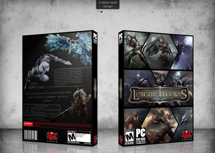
I decided to make a simple League of Legends box, i think it came out pretty nice. :)
[ Box updated on January 3rd, 2013 ] [ original ]
 League of Legends Box Cover Comments
Comment on White Wolf's League of Legends Box Art / Cover.

Needs to be more colorful. But I like it:)
[ Reply ]
Looks awesome, but bright colors would look excellent.
[ Reply ]
Yeah, i've reduced the color in about 75%, i will then inverse the process reducing only just a little bit. Thanks for your opinions. :)
[ Reply ]
It might take some time since i'l have to basicaly remade the front.
[ Reply ]
@White Wolf Done!
[ Reply ]
Still needs a lot more color.
[ Reply ]
I think with the original color would look just to much, this is my opinion.
[ Reply ]
I think now, the colour is great. The front looks really nice, but the back is boring. Some renders, a black background. :( There should be more composition there.
[ Reply ]
Very Nice
[ Reply ]
White Wolf, your design/layout from front to back is amazing. I'll agree with the above stating that color emphasis throughout *could* make it look beyond excellent. However, as you have it, focusing on design, the box stays consistent in tone and there are no clashing colors.
With that said, may I please have a printable? :)
[ Reply ]
Thanks for your opinion. I've added the printable. ;)
[ Reply ]