FF XIII has an important plot twist in its own logo, and yet some things are only spoilers when explained what they mean, so I thought no one would probably be bothered by this box that haven’t chose to play through it in the 11 months it’s been out.
I like the faded look of the front, actually. The back would probably benefit from the same effect, making it appear less crowded. The front has a sort of elegance to it, with the borders and lack of any intense colors. Having the logos be entirely white (sans drop shadows) would really fit that theme.
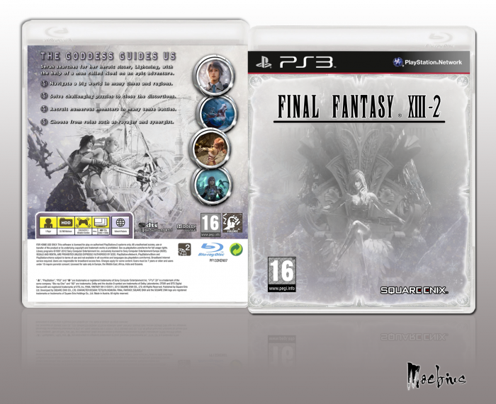
 Final Fantasy XIII-2 Box Cover Comments
This is really great, I love the black and white, but the contrast should be higher on the front to better match the back.
[ Reply ]
Hmm, good point. Thanks for the feedback.
[ Reply ]
Actually I would lower it on the back.. Like the lower contrast front better than the higher contrast art on the back.
[ Reply ]
Nice one...
[ Reply ]
:/ Why put spoilers for the last thing you see in the game (sans secret ending) on the box if they aren't necessary?
[ Reply ]
FF XIII has an important plot twist in its own logo, and yet some things are only spoilers when explained what they mean, so I thought no one would probably be bothered by this box that haven’t chose to play through it in the 11 months it’s been out.
[ Reply ]
I like the faded look of the front, actually. The back would probably benefit from the same effect, making it appear less crowded. The front has a sort of elegance to it, with the borders and lack of any intense colors. Having the logos be entirely white (sans drop shadows) would really fit that theme.
[ Reply ]