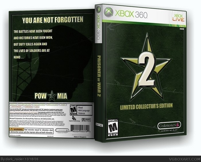
This is the sequel to Prisoner of War. I dont think they will make a sequel but it would be cool because the concept of part 1 was pretty good.
anyways go ahead and rate.
#5, ratchet, you're being too tough on everyone. seriously. you're turning into the next (old) helghastmist! you're trying to be tough. stop it. i feel you're giving (slightly) unfair scores, on almost every box.
this deserves a 4.5 imo.
the only realy problem i see is the spine temp seems a bit too big.
I like it a lot for this kind of box. (L.C.E.) If it wasn't, then it would be considered too plain. My only complaint is that the Codemasters logo seems too big IMO, but i won't let that get i nthe way of a 4.5/5 score
:P
 Prisoner of War 2 Box Cover Comments
This is the sequel to Prisoner of War. I dont think they will make a sequel but it would be cool because the concept of part 1 was pretty good.
anyways go ahead and rate.
[ Reply ]
i really like it nice job
like the 2.
[ Reply ]
It O.K but it kiddin plain and there no sceen images on the back .
[ Reply ]
collector editions dont have scene images on the back.
[ Reply ]
For a collector edition , it petty good .
4/5
[ Reply ]
thanx, has anyone here played the first one?
[ Reply ]
#5, ratchet, you're being too tough on everyone. seriously. you're turning into the next (old) helghastmist! you're trying to be tough. stop it. i feel you're giving (slightly) unfair scores, on almost every box.
this deserves a 4.5 imo.
the only realy problem i see is the spine temp seems a bit too big.
[ Reply ]
#7 Fine then i will be a lot nicer then .
I give this boxart a 4.5/5 .
[ Reply ]
One question ?
#7 How is a 4/5 a low vote ?
Sorry bout the double post .
[ Reply ]
I like it a lot for this kind of box. (L.C.E.) If it wasn't, then it would be considered too plain. My only complaint is that the Codemasters logo seems too big IMO, but i won't let that get i nthe way of a 4.5/5 score
:P
[ Reply ]
thanx wicked and Bob, i'll fix the logo and the spine when I get a chance.
[ Reply ]
I fixed the codemasters logo and I think I resized the spine
[ Reply ]