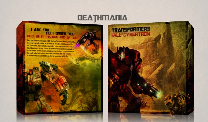
All right guys here's an experimental cover.
Credits to bastart for the logo.
And as always favourites and comments are welcome.
 Transformers: Fall of Cybertron Box Cover Comments
Comment on Deathmania's Transformers: Fall of Cybertron Box Art / Cover.
Very nice box! Fav'd! U deserved!
[ Reply ]
Looks interesting. The front looks a bit empty though.
[ Reply ]
It's still way to dark imo. the contrast should be upped a lot more. Megatron on the back, stands out too much (I'd suggest to blend him in more with the box) I also don't really like the tagline, but if you'd decide to stick with the tagline, I'd make it more like 'I ask you to help us, in this dire kind of need' and align it to the left.
[ Reply ]
Something like this? link
And I think i am going to leave the tagline as it is because if I don't the back will even more emptier than it is right now.
Thanks alot for the feedback.
[ Reply ]
@Deathmania Yeah that's better (still Megatron isn't blended in though) and make the full view a lot smaller, it's way to big at the moment.
[ Reply ]
@Bastart Alright and if I do add the grunge to megatron it make him look it makes him look even darker than he is right now and also makes him more of a silhouette which I wasnt aiming aiming to do. Also how do you make the full view smaller?
[ Reply ]
Great work...
[ Reply ]
Nice Guys
[ Reply ]
Really Nice ,
[ Reply ]
Skewing is a little off on both sides, and I agree with what Bastart is saying, but otherwise I like it.
[ Reply ]
It really is dark. Also, it doesn't really give the feel of a Transformer game with all the brown.
[ Reply ]
wow!
[ Reply ]
...its "help us in this dire TIME of need"... But the design is Amazing!
[ Reply ]