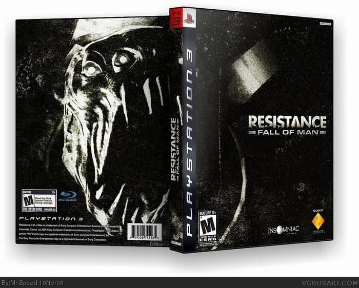
Resistance! I did'nt want to update my old one because I doubt anyone would notice, and because this is so much better, anyways, comments and rates would be nice.
Agreeing with Werdney, the logo on the spine IS the wrong way around... and the box is actually quite boring, especially the front, because there is nothing on it! Also, the back does need text of some description. 3/5
THe front pic is "kinda boring" because you shouldent just be paying attention to the front. And I didnt want to add text to the back to ruin it. And the spine logo, who gives a shit.
Don't mock me. When you post boxes, expect to get criticism. You want me to give you 5/5 for a crappy boring box that has flaws? Then you're on the wrong site.
i agree. this is desperately plain. the pic is awesome, but it is VERY plain. i could imagine something like this for some kind of limited edition packaging, but for just a regular box, theres nothing to it. 2.5/5
I was going to say something about Werdney, but I won't, just let me tell you, Werdney, you will get some tough criticism, I'll be going after details. And WickedGamer1 can talk shit, his boxes are better than mine, I can except it. Oh well, I doubt I'll be making many more boxes, school is so gay, plus I just got Xbox Live! :P Anyways, I guess thanks LnknPrkDude.
 Resistance: Fall of Man Box Cover Comments
Resistance! I did'nt want to update my old one because I doubt anyone would notice, and because this is so much better, anyways, comments and rates would be nice.
[ Reply ]
The logo on the spine is backwards. The front pic is kinda boring, and the back needs text. This really should've gone in the forums.
[ Reply ]
Agreeing with Werdney, the logo on the spine IS the wrong way around... and the box is actually quite boring, especially the front, because there is nothing on it! Also, the back does need text of some description. 3/5
[ Reply ]
THe front pic is "kinda boring" because you shouldent just be paying attention to the front. And I didnt want to add text to the back to ruin it. And the spine logo, who gives a shit.
[ Reply ]
We do.
[ Reply ]
Don't mock me. When you post boxes, expect to get criticism. You want me to give you 5/5 for a crappy boring box that has flaws? Then you're on the wrong site.
[ Reply ]
i agree. this is desperately plain. the pic is awesome, but it is VERY plain. i could imagine something like this for some kind of limited edition packaging, but for just a regular box, theres nothing to it. 2.5/5
[ Reply ]
pwnd, pwnd, and pwnd again...i give it a 3.5/5, if there was text on the back, i would give it a 4
[ Reply ]
I was going to say something about Werdney, but I won't, just let me tell you, Werdney, you will get some tough criticism, I'll be going after details. And WickedGamer1 can talk shit, his boxes are better than mine, I can except it. Oh well, I doubt I'll be making many more boxes, school is so gay, plus I just got Xbox Live! :P Anyways, I guess thanks LnknPrkDude.
[ Reply ]