I'm not really content with the fact that the front is just a wallpaper. The back could be better, but it isn't necessarily terrible. The paper looks a tad fake and would look better if you found a way to integrate it into the box smoothly.
This is the first time I have seen a L.A. Noire box that has a bright front. I mean, it is noir after all. Anyway, I like the papper on back idea but it doesn't really fit the background... What I mean is that it would be smoother on a Police Line do not cross instead, try blending it more. The front could be darker and more centered IMO.
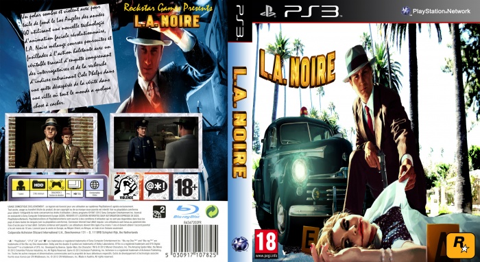
 L.A Noire Box Cover Comments
I'm not really content with the fact that the front is just a wallpaper. The back could be better, but it isn't necessarily terrible. The paper looks a tad fake and would look better if you found a way to integrate it into the box smoothly.
[ Reply ]
This is the first time I have seen a L.A. Noire box that has a bright front. I mean, it is noir after all. Anyway, I like the papper on back idea but it doesn't really fit the background... What I mean is that it would be smoother on a Police Line do not cross instead, try blending it more. The front could be darker and more centered IMO.
[ Reply ]
here at vgboxart we have standerds you did not pass them
[ Reply ]