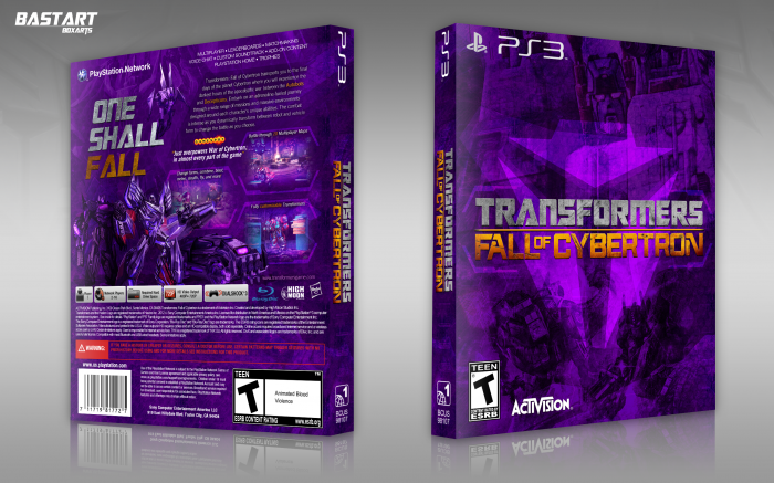
I thought it would be a nice change to focus more on the enemy of the Autobots, the Decepticons. That's why this box is mainly purple and showing Shockwave, Megatron, Soundwave and a Sentry Bot on the back. I've used some shapes from the Loading screen to make the front and the screenshot borders.
Credits to Scorpion Soldier for the PS3 template.
 Transformers: Fall of Cybertron Box Cover Comments
Comment on Bastart's Transformers: Fall of Cybertron Box Art / Cover.
I knew you would make a box art for this, I was anticipating it! Anyway, its really cool, I love the purple color scheme!
[ Reply ]
Thanks :)
b.t.w. It's actually already my 3rd box for Fall of Cybertron ;)
[ Reply ]
@Bastart Oh well I have never seen them :P
[ Reply ]
This is great! Lovely colors! The back is stunning.
[ Reply ]
Thanks SW ;)
[ Reply ]
This is fantastic man. I would have liked to maybe see a little bit lighter purple or maybe that one toned down because it is a heavy purple (If that makes sense) but that is just a preference, this is still very well designed and I love it.
[ Reply ]
Yeah, I understand what you mean. I just happen to like the deep purple :)
[ Reply ]
A well designed box, if I may say so. I quite like this, as it seems to capture an air of what the Decepticons are about. However, I do feel that the Purple may be a bit too strong, but other than that, it is a good box.
[ Reply ]
Very nice bro, I like it...
[ Reply ]
Thanks for all of the feedback!
[ Reply ]
Pretty cool!
[ Reply ]
This deserves more comments and favs. Its really well designed and looks absoloutly gorgeous with the strong purple.
[ Reply ]
Wow, this is stunning man !!!
[ Reply ]
Thank you so much for all the feedback :)
[ Reply ]
This is amazing, I love everything even the subtle
Autobot and Decetpicon symbols in the background. And especially how you made the text in the top right on the back diagonal with the design.
[ Reply ]