LOL poniez~
[ Box updated on August 1st, 2012 ] [ original ]
 The Legend of Zelda: A Link to the Past Box Cover Comments
Comment on Martiniii332's The Legend of Zelda: A Link to the Past Box Art / Cover.
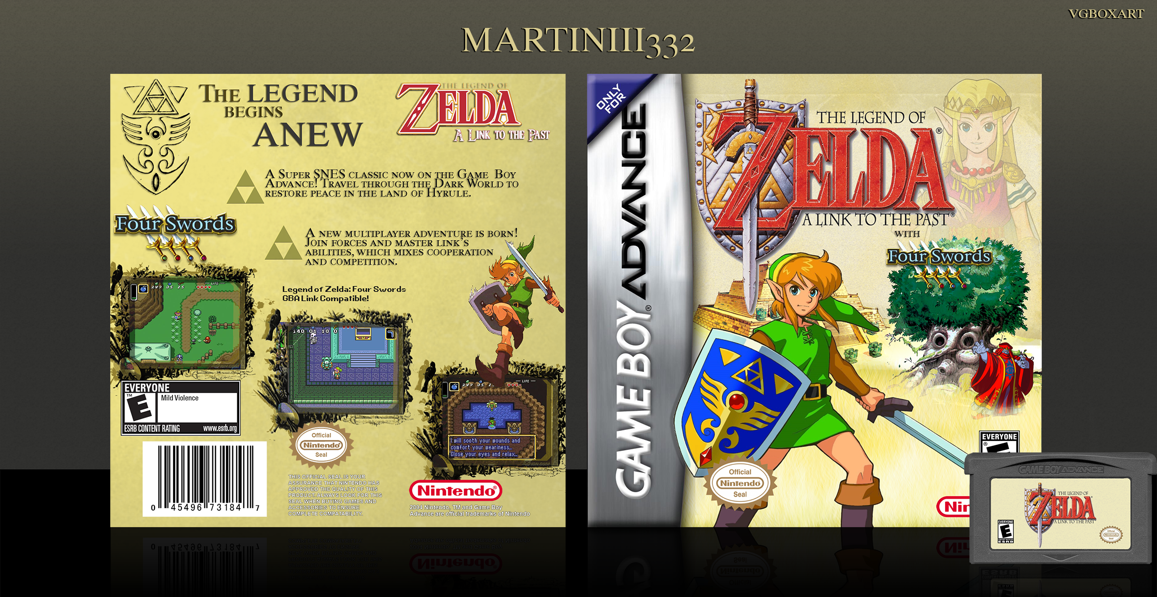
Hey guys! Initially I was going to create this for the N64, but... yeah.
Anyway, credit to sd1833/Pleiades for the awesome GBA template, and Nerdysimmer for the GBA cart.
Enjoy!
[ Reply ]
amazing! as i said before, your really good at this! keep up the good work dude! or..girl..or...alien...or..whatever you are!
[ Reply ]
Haha I am a guy with a Haruhi avatar :P but thanks man! I appreciate your kindness
[ Reply ]
Nice job man!
[ Reply ]
Thanks!
[ Reply ]
I've been looking at your first boxes on this site, and it's a tremendous achievement how you've grown into creating very good boxes. Thumbs up!
One little thing though, it seems you forgot to remove all the white background from the Link to the Past logo on the back ;-)
[ Reply ]
Thanks so much man! Yeah it may look so, but believe it or not "The Legend of Zelda" logos usually have all that white around it. I removed it and it ended up looking really bad.
[ Reply ]
@Martiniii332 That's because you didn't use the background eraser (or the pen).
[ Reply ]
@CasvalDaikun I used the pen. I personally didn't like the way it looked when I was done.
[ Reply ]
@Martiniii332 Did you cut the logo with the drop shadow? Because it seems it isn't transparent at all.
[ Reply ]
@CasvalDaikun Yes I did. I thought it'd look better than what I originally had done.
[ Reply ]
@Martiniii332 Big mistake my dear friend, if you're using the pen tool for a simple logo like this one, you have to cut the logo only (forget about the drop shadow, you can reproduce it with photoshop easily).
[ Reply ]
Oh, I thought you were talking about photoshop, because I used it to create the drop shadow. I understand how it may look bad, though, but it looked worse without the white filled in between the letters.
[ Reply ]
@Martiniii332 Worse? It is surprising, because the filled drop shadow looks really weird, especially with the sword part.
[ Reply ]
Oh, I could I miss this? It looks really great. I first thought the front was overloaded, but it actually looks good! I really love the back, though. Nice one!
[ Reply ]