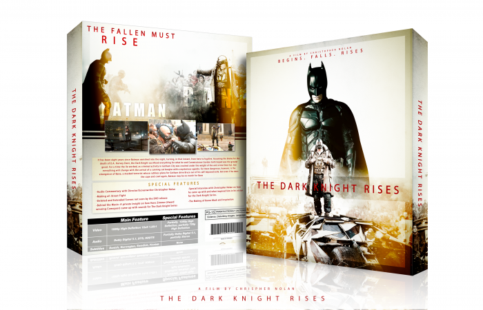
Have not made a box in about 3 Months now, but got inspired by a great movie I saw last night so decided to go with it. Anyways yea, dont have much to say. If its not up to par, probably because Im a little rusty so be gentle. Thanks for viewing
PS. Fixed Spelling.
[ Box updated on July 21st, 2012 ] [ original ]
 The Dark Knight Rises Box Cover Comments
Comment on Deividas's The Dark Knight Rises Box Art / Cover.

Awesome, I like it.
[ Reply ]
Thankss
[ Reply ]
I'm not really a fan of the front, how the black clashes with the yellow. If Batman had a yellow tinge to him, it would flow a lot better.
Still, this is a really superb design, well done.
[ Reply ]
Thanks! And thats interesting because i would say that the black and yellow go very well together, so that was the last thing i was expecting lol
[ Reply ]
So sexy. Well done, sir.
[ Reply ]
Thanks matt :)
[ Reply ]
This is pretty good. My suggestion would be to not use white backgrounds for presentations with white covers, use a darker background, everything will pop out more.
[ Reply ]
Thanks throav and you know me...im a sucker for that clean white background :)
[ Reply ]
Awesome colors!
I really like it!
[ Reply ]
Thanks man!
[ Reply ]
I really like the box! The only thing that bugs me about it, is that at the top it says, 'begings.' Did you mean begins? If you could fix that, it would be a definite fave from me! Great stuff! :)
[ Reply ]
Yea i stated that it would be fixed in the morning and it is now :) thanks
[ Reply ]
@Deividas Favourited, as deserved! :)
[ Reply ]
Colors are great! The top of the back feels empty, I think it's the placement and size of the tagline in the top left corner? (it feels forced/trapped in that corner) and the title on the spine could be moved up, so it fills the empty space at the top. Anyway, glad to see another box from you again, I almost thought you left ;)
[ Reply ]
Lol naw didnt leave just was uninspired :) and i originally had a lot more on the front and the back part but took it all off because i really loved the way the emptiness really showed the climax of the movie to me so it was intentional :)
[ Reply ]
@Deividas I can understand it was part of your design, but the title on the spine and tagline on the back just feel a bit misplaced to me :/
[ Reply ]
@Bastart I trust you ill see what i can do :)
[ Reply ]
Hot.
[ Reply ]
cool!
[ Reply ]
Nice to see you back man, great quality work as always.
[ Reply ]
thanks agent :)
[ Reply ]
Awesome! Clean and beautiful!
[ Reply ]
Thanks a lot man!
[ Reply ]
Printable please.
[ Reply ]
I really don't like the red text, but everything else is nice.
[ Reply ]
... smacked with awesomeness... err, where's da printable?
[ Reply ]
Nice, I love this I think everything complements each other. and was wondering how would you do a Dark Knight Series Bluray Box set (Just as a challenge).
[ Reply ]
Yessssssss!
[ Reply ]
Fantastic one! I first thought the colors were too bright for a Batman movie, but it actually looks pretty rad! Keep up the good work.
[ Reply ]
Nice My Friend . Please Printable
[ Reply ]
Please Printable My Friend
[ Reply ]
Wo0o0o0w . . . Awesome
[ Reply ]