I stumbled upon this thing, and in addition to how clean and lovely it is, I laughed hardily at the text on the back. Excellent use of humor for an unofficial box. Favoriting, just because of the wit.
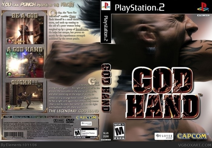
This was the original cover for the Japanese version, the American one just has the fist going across the guy's face, which completely defeats the satirical premise the J cover accomplishes.
This is an awesomely underacted game, and yeah, pretty nice box.
 God Hand Box Cover Comments
The words are hard to read, but other than that, Great! 4/5!
[ Reply ]
Thanks! (=
Its hard to head in this preview, but I printed it before finish, and the text is very clean and easy to read. (=
[ Reply ]
Nice job but the text is hard to red .
4/5
[ Reply ]
Now is hard to read? (=
In preview cover is really hard to read, but, if you see the full original cover (v.3), its nice. (=
I printed a test and its clean and easy to read. (=
Thx
[ Reply ]
i Must say this is stunning, looks 100% official ! 5/5 !
[ Reply ]
#5, Ditto.
Its really bizarre looking, not that its a problem, just something to note 5/5.
[ Reply ]
Thx for all.
I love this picture. (=
The original cover is more light, I don't like (=
[]'s
[ Reply ]
Um.
I think it's incredible. I'd love to have more people see this.
[ Reply ]
It looks like Opocolypto... (or however it's spelled)
Don't bump old boxes.
[ Reply ]
holy s***
that's awesome
[ Reply ]
Word to that noise.
I wanna get this game just so I can use this...
[ Reply ]
Man, that's gotta hurt.
Edited at 1 decade ago
[ Reply ]
ouch. i was not expecting THAT
[ Reply ]
Here, let me bump an oldass box.
I stumbled upon this thing, and in addition to how clean and lovely it is, I laughed hardily at the text on the back. Excellent use of humor for an unofficial box. Favoriting, just because of the wit.
[ Reply ]
Had to bump this, it deserves the HoF.
Great work.
[ Reply ]
#15, I can agree to that. The front is pretty much the official, but the total work is a great improvement. I love the tagline.
[ Reply ]
This was the original cover for the Japanese version, the American one just has the fist going across the guy's face, which completely defeats the satirical premise the J cover accomplishes.
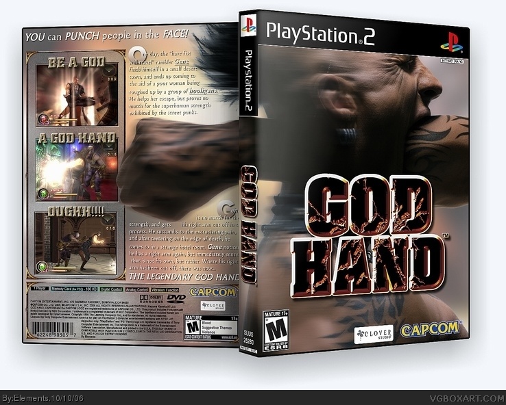
This is an awesomely underacted game, and yeah, pretty nice box.
Edited at 1 decade ago
[ Reply ]
Good, I would love to see it in 3D form.
[ Reply ]
I love this game and the box
[ Reply ]