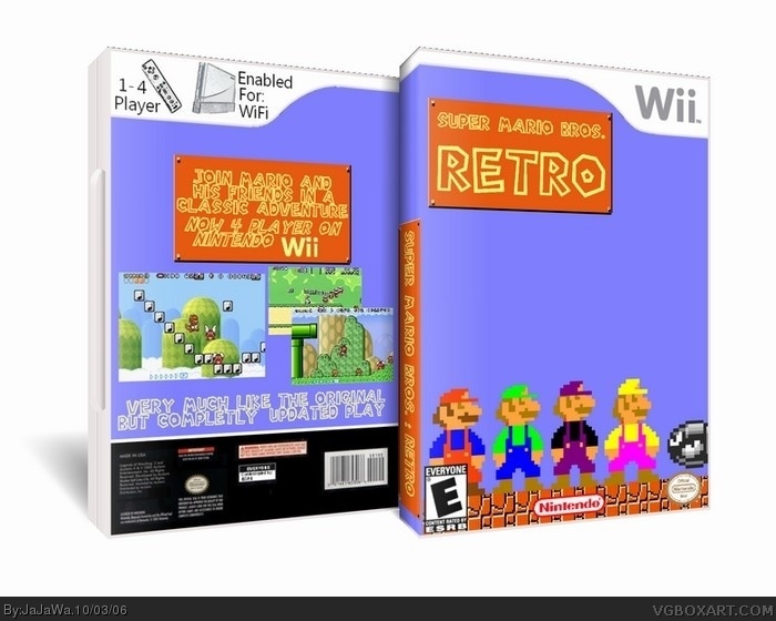
It is a lot better, but here are my suggestions:
-Move the E logo up and to the right a bit(so it's not stuck in the corner)
-The same wii template on the back is boring, do something else or do no back template at all
-Put a Wii logo on the spine and flip the super mario logo on the spine so that if the box were lying horizontally, it wouldn't be upside-down
Move the Super mario retro logo down and to the right a bit
-I love the text on the back.
-Make the screens a bit bigger.
Its got too much nothing... But it's alright... 3/5. Also, I'm quitting guys... I can't think of any boxart to do and I can't do good backgrounds because I use paint... I might add 1 more box... But I doubt it... Bye.
 Super Mario Retro Box Cover Comments
This is a huge improvment .
3.5/5
[ Reply ]
It is a lot better, but here are my suggestions:
-Move the E logo up and to the right a bit(so it's not stuck in the corner)
-The same wii template on the back is boring, do something else or do no back template at all
-Put a Wii logo on the spine and flip the super mario logo on the spine so that if the box were lying horizontally, it wouldn't be upside-down
Move the Super mario retro logo down and to the right a bit
-I love the text on the back.
-Make the screens a bit bigger.
Do all that, and you'll get at least a 4.
[ Reply ]
Thanx
[ Reply ]
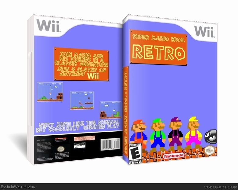
Found different shots and switched spine around in v2.
[ Reply ]
v3: Added new back template.
[ Reply ]
Now it's a lot better. 4/5, just as I promised.
[ Reply ]
terrible. Plain and dull. too much blank space.
[ Reply ]
Its got too much nothing... But it's alright... 3/5. Also, I'm quitting guys... I can't think of any boxart to do and I can't do good backgrounds because I use paint... I might add 1 more box... But I doubt it... Bye.
[ Reply ]