Not bad, I like the style. But maybe too much text. And the front is too full. I like the character, he should stick out more, I think. And the back doesn't please me, because it's really too much text, without any composition whatsoever.
Maybe work on the front a little bit more (the "A" is way too big - what's the message behind that?!) and it could get very abstract but neat. :)
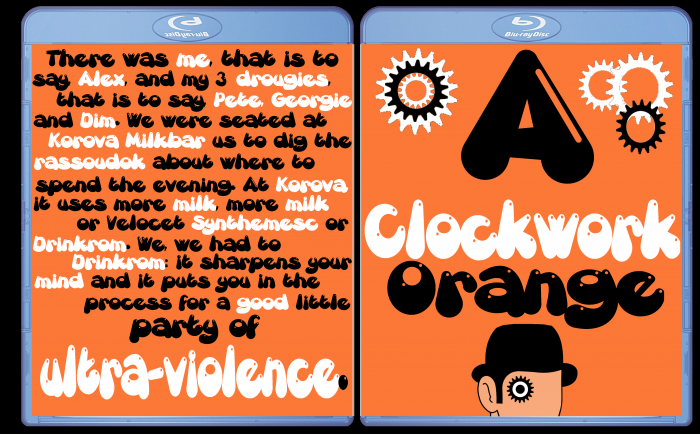
 A Clockwork Orange Box Cover Comments
Not bad, I like the style. But maybe too much text. And the front is too full. I like the character, he should stick out more, I think. And the back doesn't please me, because it's really too much text, without any composition whatsoever.
Maybe work on the front a little bit more (the "A" is way too big - what's the message behind that?!) and it could get very abstract but neat. :)
[ Reply ]