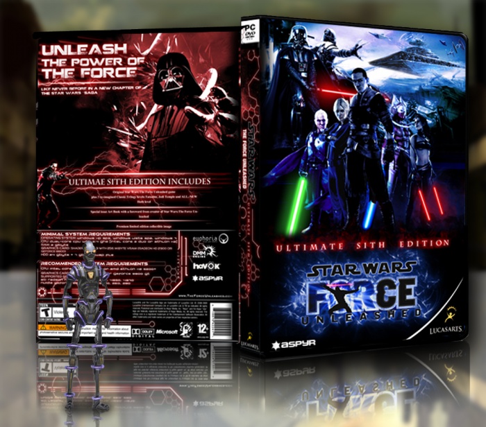
my next box hope you like
[ Box updated on September 9th, 2013 ] [ original ]
 Star Wars The Force Unleashed: Sith Edition Box Cover Comments
Comment on DaFF's Star Wars The Force Unleashed: Sith Edition Box Art / Cover.
This is absolutely fantastic.
[ Reply ]
This is beautiful!
[ Reply ]
This is pretty neat but why are you using MadSpike's presentation?
[ Reply ]
Yeah, I was just about to say that.
[ Reply ]
its now better?? :)
[ Reply ]
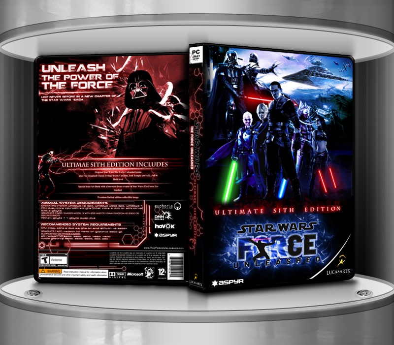
Too blurry. Do you have a version with higher resolution?
What I can already say:
IMO it lacks a bit of alternation in colours. The blue-red effect is cool, but the front is TOO blue and the back TOO red. There should be more effects to accentuate things. For example on the back Darth Vader clearly fades away with the background for me. He's not instantly recognizable.
As for the rest, I like it very much! Nice composition, good selection of artwork. Screenshots of the back would have been nice, but are not strictly necessary.
[ Reply ]
pritabel is veeery high resolution so i can uplad it here
[ Reply ]