Yes, another one. Don't really know if I'd get the game, but the Blackwatch Collectors Edition looks loaded with stuff, We'll see.
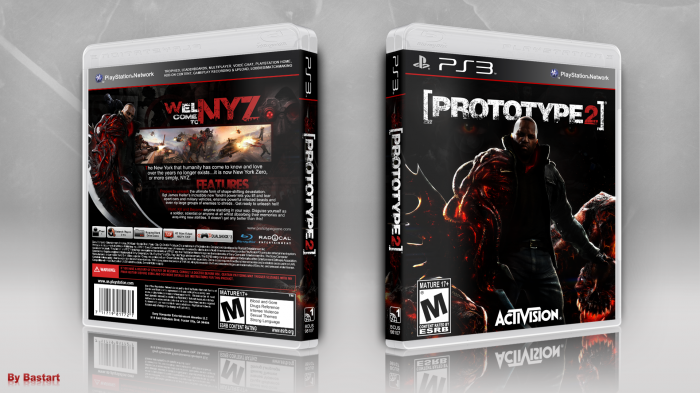
Okay now for the box, continueing with the dark theme on my boxes. I modified a wallpaper to match the contrast of the box. Made a new James Heller render and added some blending propaganda images to the back, hope you'll like it....
I've also made a change to the presentation this time around.
I personally think the original cover link looks kinda bland :/ The render looks boring and the only thing I actually like about it, is the NYZ city backdrop. The steelbook edition link looks rather interesting instead, except for the green outline, it's extremely hideous :/
[ Box updated on February 24th, 2012 ] [ original ]
 Prototype 2 Box Cover Comments
Comment on Bastart's Prototype 2 Box Art / Cover.
Flawless really
[ Reply ]
Thanks ;)
[ Reply ]
@Bastart Flawless Victory! ; )
[ Reply ]
Awesome, it looks really official and neat !
[ Reply ]
Thank you, you're Blues Bros. box is awesome to ;)
[ Reply ]
Personally your best Prototype 2 Box, however can you increase the opacity of the eyes behind Heller on the front.
[ Reply ]
it supposed to look very dark and mysterious, so once I brighten the eyes of Mercer it loses the gritty dark feel imo. but I do get what you mean and like to see, but it's just my choice of the front design.
[ Reply ]
Not a huge fan of the splitting up of "welcome" into 2 pieces but other than that...I love that back :) Great job
[ Reply ]
Yeah, I see what you mean, but I actualIy was kinda forced to split it in two parts due the lack of space on that side, because I didn't want to cover up the infected image next to it.
[ Reply ]
I love it, Very nice cover.
Your style = My taste :D
[ Reply ]
your comment = My food ;)
[ Reply ]
I've looked this over more than once, and can't say I have anything to suggest. All in all, it's a well made cover with a traditional yet polished layout. I will say I'm glad you've dropped the steelbook template since your last Prototype cover.
[ Reply ]
Thanks, it's actually the first time you haven't got any critisism on one of my boxes, C'mon there has to be something, right? :P and yeah, the steelbook template didn't worked out that well, I still think the 2nd version of it was pretty decent :/
[ Reply ]
I'm not one to neglect mentioning details that need adjustment, no matter the significance. I don't see anything wrong here, really.
[ Reply ]
Really nice! I like this.
[ Reply ]
Thanks, I'm glad you like it.
[ Reply ]
The front is a little dark, but it fits with the theme of the rest of the box, and therefore is awesome.
[ Reply ]
Thanks :)
that's really what I intended to do, having a dark vibe on the box.
[ Reply ]
Love the dark theme!
[ Reply ]