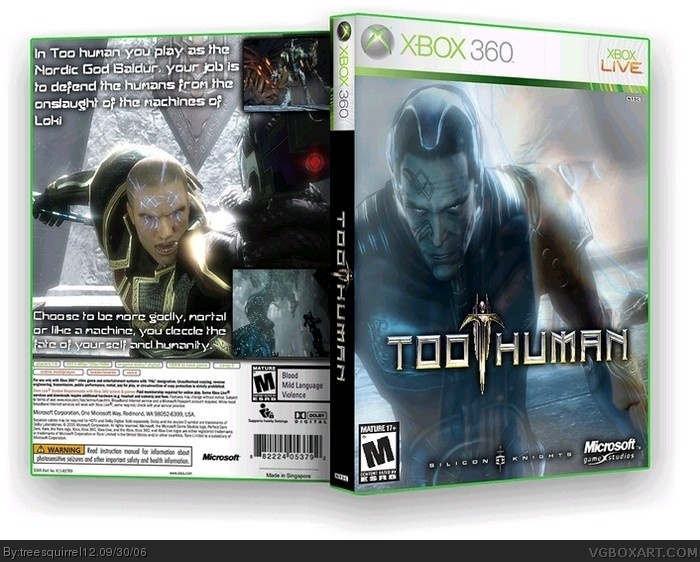
I do like it but I think it has more potential to be achieved, one more screenie should be there and there should be a bit more text but less big for balance.
4/5.
#3, once text is bigger and is more, cover and overlay the text more on the guy and the third screenshot should be between the second and first, it does'nt matter if you cover the guy up a bit more more aslong as you don't squash him, real boxes do that.
 Too Human Box Cover Comments
i hope you like it I worked hard on it.
[ Reply ]
I do like it but I think it has more potential to be achieved, one more screenie should be there and there should be a bit more text but less big for balance.
4/5.
[ Reply ]
ok any suggestions of where the 3rd screen should go, and the size of all text?
[ Reply ]
#3, once text is bigger and is more, cover and overlay the text more on the guy and the third screenshot should be between the second and first, it does'nt matter if you cover the guy up a bit more more aslong as you don't squash him, real boxes do that.
[ Reply ]