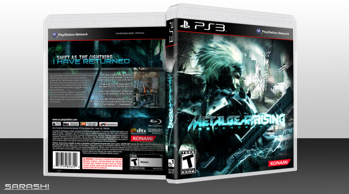
I guess, Hello again people, Credit to Sens for the plastic.
I guess I like this design. I love scanlines and the wave function.
Hope you enjoy, and view the printable, else view it in full view to see the scanlines and warp without compression.
[ Box updated on February 3rd, 2012 ] [ original ]
 Metal Gear Rising: Revengeance Box Cover Comments
Comment on Sarashi's Metal Gear Rising: Revengeance Box Art / Cover.
It's a good design, if a bit generic, but the scanlines are much too heavy.
[ Reply ]
I'm going to agree with this. Great design and everything, but I would really love it if you tone downed the scanlines a bit.
[ Reply ]
Sexy. I love the scanlines personally.
[ Reply ]
like it a lot
[ Reply ]
I love it. <3
[ Reply ]
The teal colors you've used work well in combination with Raiden and the lightning theme of Reveangance, though I feel the saturation is somewhat overwhelming. Might I suggest either reducing the scanlines on Raiden, desaturating his environment, or both to better emphasize his presence on the front?
[ Reply ]
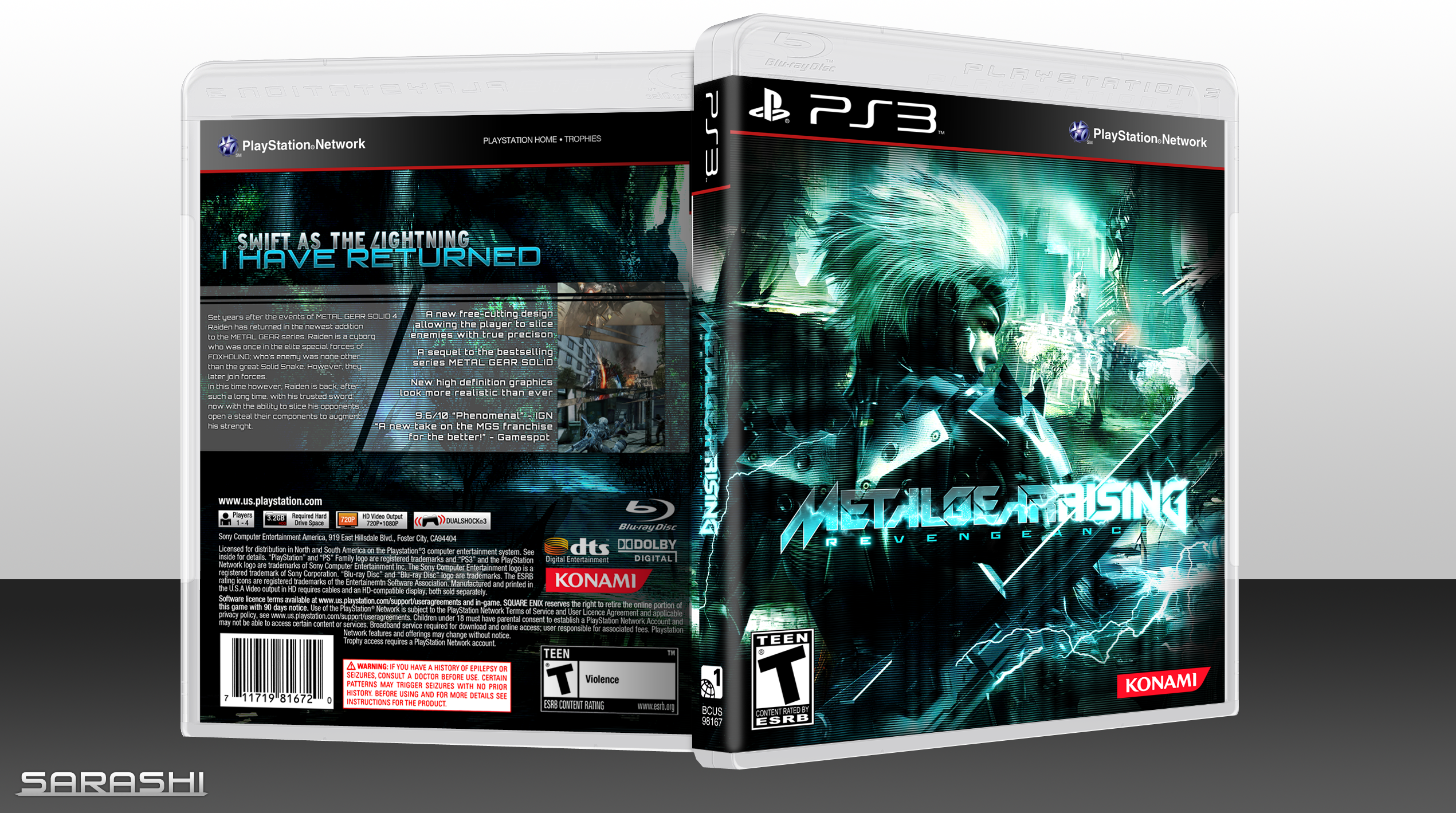
I like the front but not the back.
[ Reply ]
Welcome back and a great cover. Front especially.
[ Reply ]
Update: Reduced scanlines and saturation.
[ Reply ]
Woah, that front looks amazing.
[ Reply ]
Please also do note I know nothing about MGS.
[ Reply ]
I still think the scanlines are still too strong. And I believe the game will be rated M.
[ Reply ]
The printable does not seem to update. I hope you are judging this by full view.
[ Reply ]
I like the front besides the logo which is a bit hard to see. The back is too empty, imo. I see what you wanted to do with screenshots but I think you could have executed that idea better
[ Reply ]
This is great! Nice consistent colour scheme and neat layout on the back.
[ Reply ]