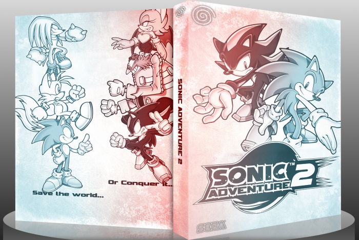
In honor of the new site, I decided to try making another box. I know, it's not my best, but I really wanted to submit one for the release. If this isn't much to you, you can expect better for the Kickstart 2012 event. Until then, peace.
 Sonic Adventure 2 Box Cover Comments
Comment on Ronthis the Werewolf's Sonic Adventure 2 Box Art / Cover.

Awesome! I just don't like the empty space on the back, but overall, this is great!
[ Reply ]
this.
[ Reply ]
Although the front is just images with a crappy filter over the top, you managed to actually make it look really cool. The front is great. My problem is that the back isn't nearly as memorable. It looks too full and too empty at the same time.
[ Reply ]
Yeah, I really didn't know what to do with the back, so that came to be :/
[ Reply ]
I agree with this post. The front looks better than the back. It's just a bit dull and empty. The placement of the title might be better off reconsidered as well.
overall, I quite like it =]
[ Reply ]
The front is cool, but the back looks empty. :/
[ Reply ]
Same with everyone else, I love the simplicity of the front, but it doesn't reallly have the same feel on the back.
[ Reply ]
this is pretty cool despite the large empty spaces, ive recently joined this site and have some pretty cool box arts ill be uploading :D
[ Reply ]
Woah! I like this alot. I really like the style you went with.
[ Reply ]
I like it dude.
[ Reply ]
Nice colors, and the simple white backdrop is preferable to something busier. The back, however, looks rushed and incomplete. The text is unevenly placed, and the character placement is a tad dull.
[ Reply ]
I really like where this is going, but I feel as if the box is incomplete. You should move the logo on the front up a bit more, and maybe have Sonic's arm overlapping it. As for the back, I recommend you start over, or do some heavy modifying. You should probably make sure everything is even, move the characters closer to the edges, and maybe put some sort of description between them. I'm not really feeling this one yet.
[ Reply ]
Oooh... pretty colors.
[ Reply ]
Like a few other people have stated, the back is what really hurts this box. I like the front, even with the unexpected use of filters for a Sonic game, but it looks pretty good. The lack of structure, awkward character and tagline placement are my complaints with the back.
[ Reply ]
Simply and beautiful, I just love.
Congratulations, pal!
[ Reply ]
looks like a limited edition copy if you ask me but great job
[ Reply ]
Stylish cover!
[ Reply ]