I actually love the inverted look of the front. It's a nice contrast between this and your previous Demon's Souls cover, and not entirely unfitting of the game.
What the fuck is this? It's strangely attractive. I like the simplicity of the back and the effect you were going for on the front works really well. Nice work.
At first I didn't like this, but I guess that was because it's just too damn stylish and had to sink in because it's pretty great. I like the Demon's Souls box better though, also I find it kinda funny that "Dark" souls is the light box.
#12, Wow, thank you for the kind words. That's really touch. :D
#13, Haha, I intended to make this one dark and the other white. But I think the Demon's Souls box looks better with dark color.
Interesting design with the inverted look, and it actually turned out pretty good. I too like your Demons Souls box better, but this is still very very well done. Great job.
 Dark Souls Box Cover Comments
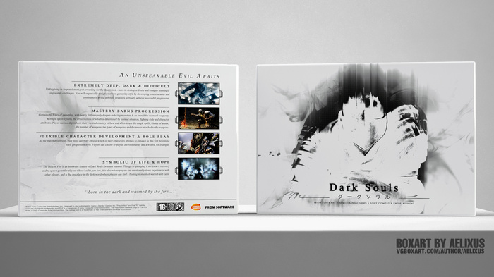
Continue the series, this is my Dark Souls box. You can view my Demon's Souls box here: link
Hope you all like it!
[ Reply ]
I don't like the inverted image on the front.
[ Reply ]
I actually love the inverted look of the front. It's a nice contrast between this and your previous Demon's Souls cover, and not entirely unfitting of the game.
[ Reply ]
#2, Sorry Thro, but I like that, the front tooks me some time and I think it looks like the soul go into the knight body. Thanks! :D
#3, Thanks, Sd!
Edited at 1 decade ago
[ Reply ]
I really like it. The black "motion blur" stuff on the front does not fit, though (in my opinion.
[ Reply ]
#4, That works
[ Reply ]
I like this one more than the Demon's Soul box.
Is Biihli Throavium?
[ Reply ]
Eh. I really dislike the back.
[ Reply ]
Thanks guys!
#8, Why? O.o
[ Reply ]
What the fuck is this? It's strangely attractive. I like the simplicity of the back and the effect you were going for on the front works really well. Nice work.
[ Reply ]
Haha, thank you so much!
[ Reply ]
Not even going to comment, because I've run out of adjectives for your boxes. You are the greatest thing ever.
[ Reply ]
At first I didn't like this, but I guess that was because it's just too damn stylish and had to sink in because it's pretty great. I like the Demon's Souls box better though, also I find it kinda funny that "Dark" souls is the light box.
Edited at 1 decade ago
[ Reply ]
#12, Wow, thank you for the kind words. That's really touch. :D
#13, Haha, I intended to make this one dark and the other white. But I think the Demon's Souls box looks better with dark color.
[ Reply ]
Beautiful! Please check out my boxes as it has not been viewed by anyone yet.
+fav
[ Reply ]
Thanks.
[ Reply ]
Interesting design with the inverted look, and it actually turned out pretty good. I too like your Demons Souls box better, but this is still very very well done. Great job.
[ Reply ]
Thanks, man. :D
[ Reply ]