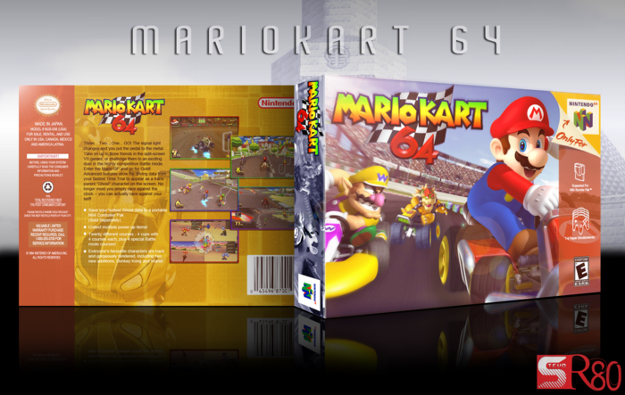
Nice lighting on the front, and the sense of speed is pretty well presented too. Bowser looks out of place though, and I think it's the angle of his kart against the angle of the track. They don't line up properly. That's a minor qualm with an otherwise solid cover though. The back is suitably retro and I have nothing to point out. Good work.
Holy shit this is brilliant! I've been watching you in the WIP forums and I know you are one of those artists who take constructive feedback and you develop it more and more until it's perfect like this shit right here. You've got everything spot on like the editing and the colours.Good job dude!
This is spectacular in terms of design. A great homage to retro designs. But as I said on your WIP thread, I still think I would prefer it without the glow in the corner. The spine also looks strange, since it's the only thing in the design that hasn't been given a glow. It looks much too dark in comparison. It also looks like you didn't skew the logo to match the rest of the spine.
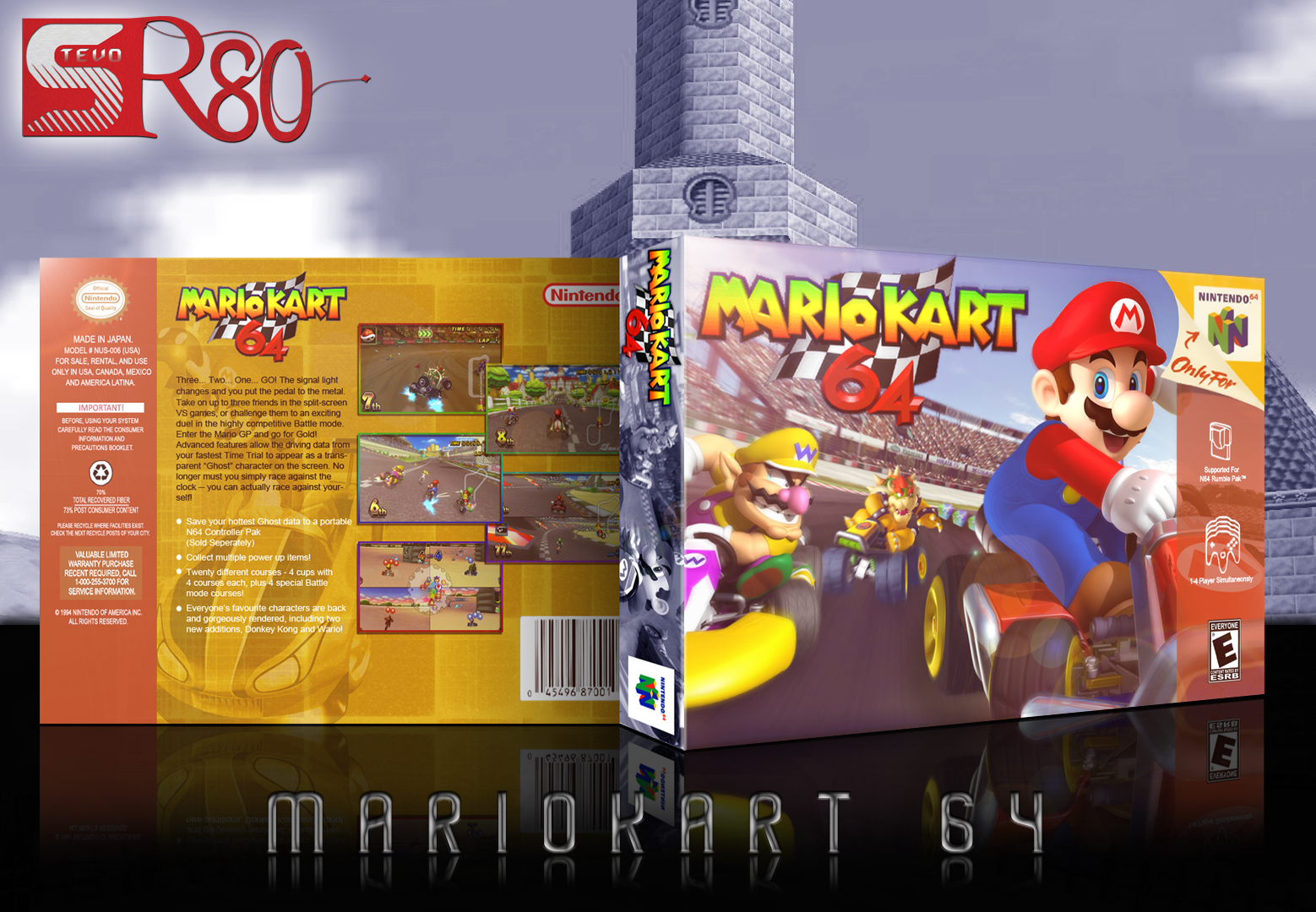
My only other issue is with the presentation. It's 1) Too large, and 2) Too complex. The box should be the focus, not the complex background. Besides that, it's a bit strange. Your user logo is enormous, practically the size of half the box, then we have the castle in the background, which is too complex, and finally the odd black gradient directly under the box, which doesn't fit the rest of the design at all.
I love the box, I really do. It's a great design. But those small issues take too much away from it, in my opinion. Focus on the presentation as well as the box design.
This is great. I don't remember faving this, but I'm glad I did anyway. Needs hall. It's nice to see retro covers instead of the usual PS3-XBOX360 thing we have going on nowadays.
 Mario Kart 64 Box Cover Comments
What else can I say, I LOVE remakes :)
[ Reply ]
Dude, this is freaking amazing man, great job!
[ Reply ]
Holy fuck.
[ Reply ]
Haha, that is all kinds of awesome.
[ Reply ]
Nice lighting on the front, and the sense of speed is pretty well presented too. Bowser looks out of place though, and I think it's the angle of his kart against the angle of the track. They don't line up properly. That's a minor qualm with an otherwise solid cover though. The back is suitably retro and I have nothing to point out. Good work.
[ Reply ]
Oh my gosh, it's beautiful!
[ Reply ]
Holy shit this is brilliant! I've been watching you in the WIP forums and I know you are one of those artists who take constructive feedback and you develop it more and more until it's perfect like this shit right here. You've got everything spot on like the editing and the colours.Good job dude!
[ Reply ]
#7, Ha thanks!
Much appreciated guys.
[ Reply ]
If this was facebook i would definetly press like with different accounts.
[ Reply ]
Very Nice :3
[ Reply ]
This is spectacular in terms of design. A great homage to retro designs. But as I said on your WIP thread, I still think I would prefer it without the glow in the corner. The spine also looks strange, since it's the only thing in the design that hasn't been given a glow. It looks much too dark in comparison. It also looks like you didn't skew the logo to match the rest of the spine.
My only other issue is with the presentation. It's 1) Too large, and 2) Too complex. The box should be the focus, not the complex background. Besides that, it's a bit strange. Your user logo is enormous, practically the size of half the box, then we have the castle in the background, which is too complex, and finally the odd black gradient directly under the box, which doesn't fit the rest of the design at all.
I love the box, I really do. It's a great design. But those small issues take too much away from it, in my opinion. Focus on the presentation as well as the box design.
[ Reply ]
#11, I appreciate your input. I'll get to work on it.
[ Reply ]
Looks really professional! Fav+
[ Reply ]
Bump.
[ Reply ]
haha, thanks Matt!
[ Reply ]
That front is amazing, and though the back doesn't appeal to me, I can see that it is meant to be an imitation of a 64 box.
[ Reply ]
It looks really authentic. The lighting struck me as odd at first, but I grew into it.
Great cover!
[ Reply ]
This is great. I don't remember faving this, but I'm glad I did anyway. Needs hall. It's nice to see retro covers instead of the usual PS3-XBOX360 thing we have going on nowadays.
[ Reply ]
Appreciate your comments :)
[ Reply ]
printable?
[ Reply ]
I mean I don't really know how you'd print this and apply it to an N64 box lol
[ Reply ]