A grand improvement over all my boxes. The idea came from my last box, link , and I think it was much better implemented here. As always, critiques, helpful hints, or maybe, if you're feeling lucky, faves. Spent a long time on this. Thanks! :)
P.S. template credit to jevangod. Again.
The front is pretty bland and boring. The logos are not cut well and choppy. The back is bland, uninformative, and generally unattractive. The fact that everything is on black makes it seem unprofessional and frankly very newbish.
#2, Thanks for the critiques. The front was supposed to be very simplistic, though I get where you're coming from. Kind of disapointed though there was no props on Jack's front cover appearance. Though I have to agree the bad could use alot of work.
Oh well, expect an update soon fixing at least the majority of those problems.
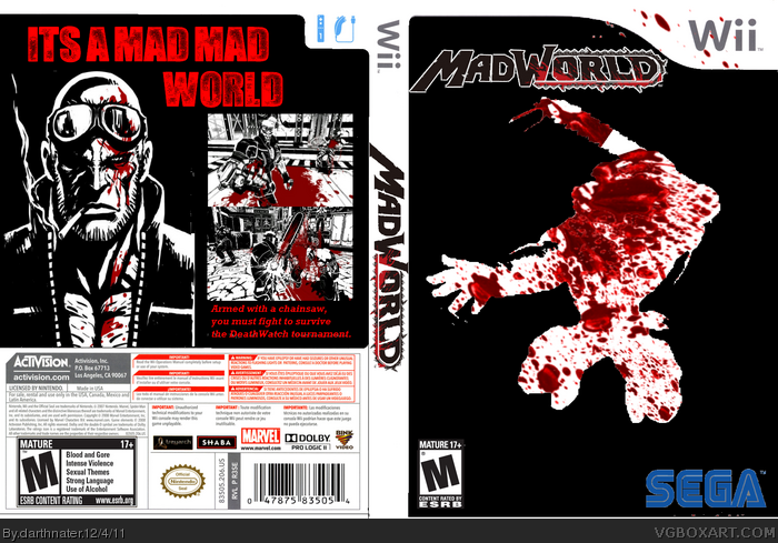
 Mad World Box Cover Comments
A grand improvement over all my boxes. The idea came from my last box, link , and I think it was much better implemented here. As always, critiques, helpful hints, or maybe, if you're feeling lucky, faves. Spent a long time on this. Thanks! :)
P.S. template credit to jevangod. Again.
Edited at 1 decade ago
[ Reply ]
The front is pretty bland and boring. The logos are not cut well and choppy. The back is bland, uninformative, and generally unattractive. The fact that everything is on black makes it seem unprofessional and frankly very newbish.
[ Reply ]
#2, Thanks for the critiques. The front was supposed to be very simplistic, though I get where you're coming from. Kind of disapointed though there was no props on Jack's front cover appearance. Though I have to agree the bad could use alot of work.
Oh well, expect an update soon fixing at least the majority of those problems.
Edited at 1 decade ago
[ Reply ]