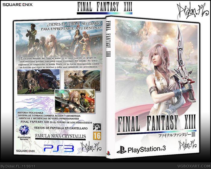
Hi guys. This is my cover art of Final Fantasy 13. Decideme than you think. I'm starting in the design of covers and I wonder what you think to improve on future designs.
It's certainly not bad. Its a good start. Um...try not to drown the box in logos. If you could rearrange your back in a manner that is more attractive in terms of text that would be great. Though i dont mind this format too much. However, one thing is important. Do not use more than one type of PS3 logo. It marks inconsistency. Normally the ESRB/PEGI Rating and the Square Enix would go on the front.
Thanks for the feedback. On the issue of the logos, I do not like who are on the cover, I prefer this clear since its mission is presentarno the game and put on the back cover information Tada. A greeting from Spain.
The front's simple both in appearance and execution, but the brightly lit yet restrained colors look nice. Very tasteful in nature.
I like the overlapping screenshots, but the back as a whole is a little too messy. The vast array of logos towards the bottom doesn't necessarily look better than the official template. I'd suggest swapping it out.
 Final Fantasy XIII - Spanish Box Cover Comments
Hi guys. This is my cover art of Final Fantasy 13. Decideme than you think. I'm starting in the design of covers and I wonder what you think to improve on future designs.
[ Reply ]
It's certainly not bad. Its a good start. Um...try not to drown the box in logos. If you could rearrange your back in a manner that is more attractive in terms of text that would be great. Though i dont mind this format too much. However, one thing is important. Do not use more than one type of PS3 logo. It marks inconsistency. Normally the ESRB/PEGI Rating and the Square Enix would go on the front.
But i like it.
Alot.
And for a new guy you did it well. Nice work.
[ Reply ]
Very nice.
[ Reply ]
Very nice indeed.
[ Reply ]
Thanks for the feedback. On the issue of the logos, I do not like who are on the cover, I prefer this clear since its mission is presentarno the game and put on the back cover information Tada. A greeting from Spain.
[ Reply ]
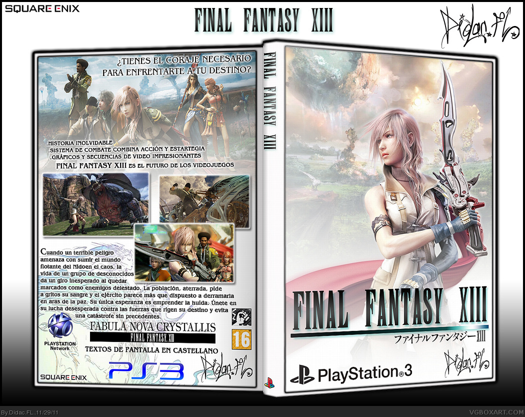
I made a few changes, I removed the black border and I rearranged the text as Icyfirefists advise me. Tell me what you think now.
[ Reply ]
I love it. although i didnt think the black border needed to go. Either way its a beautiful box.
[ Reply ]
The front's simple both in appearance and execution, but the brightly lit yet restrained colors look nice. Very tasteful in nature.
I like the overlapping screenshots, but the back as a whole is a little too messy. The vast array of logos towards the bottom doesn't necessarily look better than the official template. I'd suggest swapping it out.
[ Reply ]