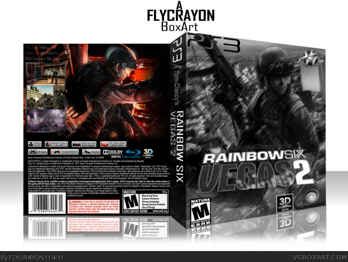
It appears unfinished in my eyes, notably due to the lack of a synopsis, tagline or even features text on the back.
The front's greyscale approach somewhat bothers me as well. The image itself looks like it could work on it's own, but the colors are an important aspect, and of this game specifically. Vegas is not known for being subtle, or subdued, especially from a visual standpoint. Bright, vibrant colors and lights are perfectly fitting and would really help this cover stand out.
 Tom Clancy's Rainbow Six Vegas 2 Box Cover Comments
Honstly This Is My Favorate Box that I Have Created In A While And I'm Glad To Be Back In To Doing This Kind.
[ Reply ]
It appears unfinished in my eyes, notably due to the lack of a synopsis, tagline or even features text on the back.
The front's greyscale approach somewhat bothers me as well. The image itself looks like it could work on it's own, but the colors are an important aspect, and of this game specifically. Vegas is not known for being subtle, or subdued, especially from a visual standpoint. Bright, vibrant colors and lights are perfectly fitting and would really help this cover stand out.
[ Reply ]