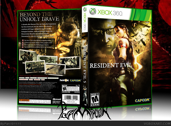
Very nice. I feel that Chris should be on the front thought since he's the main character, although I could see Sheva going on front alone if this was collector's edition though.
Righ here you have what, I think, may be your best box; the back is my favourite part, everything there seems well organized and proffesional looking, even though I think that the game site's URL should be larger and/or made of a less dark color than its current red, as right now it's very hard to read, or even to notice; and that I'm not too fond of the coloring at the right part of the tagline, It'd look better to have the whole tagline colorized instead of only a part, as it'd bring color diversity to the currently almost all white text. On the front, I can see Jevangod's point when he said that you should put Chris in there, he being the main character, but that's not the only thing that is bothering me. The "5" part of the logo is hard to notice, at first glance it reads only "Resident Evil" alone. Other thing I don't like is the transition between the color scheme of Sheva and the background she's on; the background (Specially the guy's face and around the birds) has on it a strong yellow tint on it, a yellow that looks out of tune compared to the most yellowbrown-like color scheme of the rest of the box, but specially in the parts where it clashes with Sheva and her lower surroundings. I also dislike the way that you put Chris on the spine, somehow it seems like you only did it as a filler.
It's a good box, and the back's great, but it still have some things that could be worked on more, I think.
P.S.: The reflection is messed up in some parts, check it under the spine and under the left part of the back.
#7, Points noted, and I'll address some of them. The reflection is messed up because I had to rush that part to get this uploaded before I went to the store.
About the Chris on the spine, I do this a lot with PS2 games and it always looks fine, 360 games have a really small NTSC logo so it makes it look like the character is floating rather than standing like my PS2 boxes.
The logo looked, and still looks fine to me, but that could be because I know that there is a 5 because I put it there.
As for Chris not being on the front, I was going to put him but I liked the way it looked with just Sheva in the center, Chris took up too much space.
I originally had more color to the back tagline, but it was too yellow for my liking so I made it more white.
I'll get crackin on an update, and try and fix some things.
And to anyone who said "this" ... real comment please? : )
I don't mind Chris' absence, and I feel giving Sheva top billing not only gives this distinction among the slew of RE5 covers, but also puts aside the tired co-op features and instead gives more of a solitary feeling one would expect from a survival-horror game.
I do feel Wesker could be more effectively blended into the background though (that is Wesker, correct?). The yellow tone to both upper corners is way too strong, which may be the cause of Wesker appearing more visible than he should.
Manuel already noted most the issues at hand, and while I'm not sure I feel this is you're absolute best effort, it's still more than a solid design. Good work.
I think it was very brave and wise of you to focus on Sheva instead of boring ol' Chris for the front. It works very well with the whole composition of the box. The colours and everything else are pretty much spot-on.
The only niggle I have is that there's a tiny little Chris on the spine which is, my view, a little distracting and unnecessary.
Still, another stellar piece of work here Pan. Great job!
I just took a look at this on another computer monitor, and the colors and blending look horrible! They looked fine on my monitor, but I'l going to try and fix this.
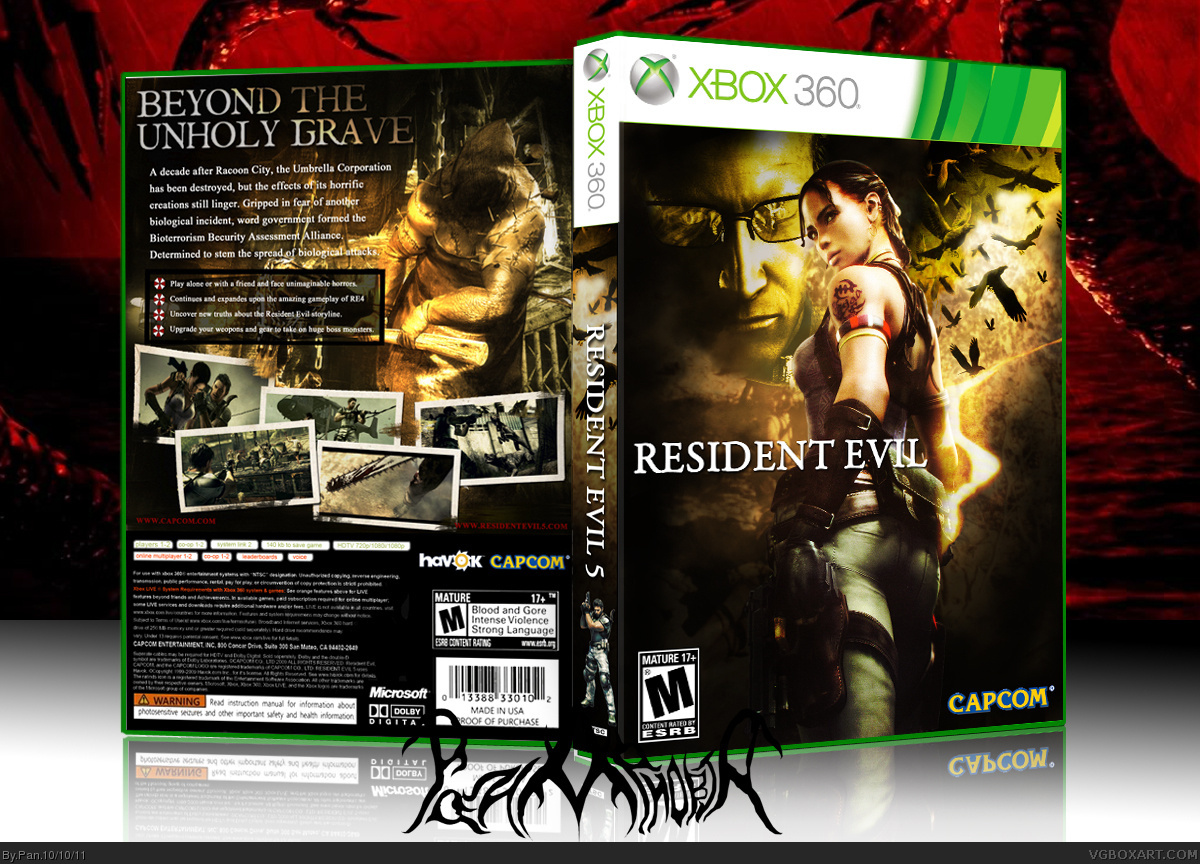
Updated the box with fixed colors and some other fixes, I had my monitor set to "vivid" so that's why the colors were off. I also uploaded the printable.
 Resident Evil 5 Box Cover Comments
Inspired by Jevangods new box, obviously.
Edited at 1 decade ago
[ Reply ]
Very nice. I feel that Chris should be on the front thought since he's the main character, although I could see Sheva going on front alone if this was collector's edition though.
[ Reply ]
#2, This
[ Reply ]
#2, this.
[ Reply ]
#2, This
[ Reply ]
#2, this
[ Reply ]
Righ here you have what, I think, may be your best box; the back is my favourite part, everything there seems well organized and proffesional looking, even though I think that the game site's URL should be larger and/or made of a less dark color than its current red, as right now it's very hard to read, or even to notice; and that I'm not too fond of the coloring at the right part of the tagline, It'd look better to have the whole tagline colorized instead of only a part, as it'd bring color diversity to the currently almost all white text. On the front, I can see Jevangod's point when he said that you should put Chris in there, he being the main character, but that's not the only thing that is bothering me. The "5" part of the logo is hard to notice, at first glance it reads only "Resident Evil" alone. Other thing I don't like is the transition between the color scheme of Sheva and the background she's on; the background (Specially the guy's face and around the birds) has on it a strong yellow tint on it, a yellow that looks out of tune compared to the most yellowbrown-like color scheme of the rest of the box, but specially in the parts where it clashes with Sheva and her lower surroundings. I also dislike the way that you put Chris on the spine, somehow it seems like you only did it as a filler.
It's a good box, and the back's great, but it still have some things that could be worked on more, I think.
P.S.: The reflection is messed up in some parts, check it under the spine and under the left part of the back.
[ Reply ]
#7, Agreed. The back is great.
[ Reply ]
#7, Points noted, and I'll address some of them. The reflection is messed up because I had to rush that part to get this uploaded before I went to the store.
About the Chris on the spine, I do this a lot with PS2 games and it always looks fine, 360 games have a really small NTSC logo so it makes it look like the character is floating rather than standing like my PS2 boxes.
The logo looked, and still looks fine to me, but that could be because I know that there is a 5 because I put it there.
As for Chris not being on the front, I was going to put him but I liked the way it looked with just Sheva in the center, Chris took up too much space.
I originally had more color to the back tagline, but it was too yellow for my liking so I made it more white.
I'll get crackin on an update, and try and fix some things.
And to anyone who said "this" ... real comment please? : )
Edited at 1 decade ago
[ Reply ]
The back is great, but like everyone else I'm not a fan of Sheva being the focus of the front.
[ Reply ]
I don't mind Chris' absence, and I feel giving Sheva top billing not only gives this distinction among the slew of RE5 covers, but also puts aside the tired co-op features and instead gives more of a solitary feeling one would expect from a survival-horror game.
I do feel Wesker could be more effectively blended into the background though (that is Wesker, correct?). The yellow tone to both upper corners is way too strong, which may be the cause of Wesker appearing more visible than he should.
Manuel already noted most the issues at hand, and while I'm not sure I feel this is you're absolute best effort, it's still more than a solid design. Good work.
[ Reply ]
#2 This
[ Reply ]
Another stunning work, mate.
[ Reply ]
I think it was very brave and wise of you to focus on Sheva instead of boring ol' Chris for the front. It works very well with the whole composition of the box. The colours and everything else are pretty much spot-on.
The only niggle I have is that there's a tiny little Chris on the spine which is, my view, a little distracting and unnecessary.
Still, another stellar piece of work here Pan. Great job!
[ Reply ]
I just took a look at this on another computer monitor, and the colors and blending look horrible! They looked fine on my monitor, but I'l going to try and fix this.
[ Reply ]
...Printable..Please!!!
[ Reply ]
Updated the box with fixed colors and some other fixes, I had my monitor set to "vivid" so that's why the colors were off. I also uploaded the printable.
[ Reply ]
Amazing. Love the colors.
[ Reply ]
Epic fav
[ Reply ]
WHAT A BOX! Honestly its better than the original, But i don't think just moving some text call it a version
[ Reply ]