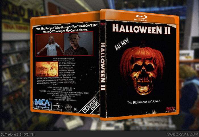
First time I've ever tried doing "worn & aged" effects for a submitted box, think I did fairly well.
Made to look like a "well loved" VHS tape with all its retro and simplistic charms.
The printable version does not have the aged effect.
Pretty neat. My biggest suggestion would be to work on your presentation. Go download a movie case template and put your design inside it. That way it will look more professional and appealing.
Looks much better with the proper template and presentation.
However, there are still few things that I personally would change; a) the screenshot borders are very simple and do not fit, b) the empty space to the right of the text on the back, and c) I would remove "All New" text from the back.
I can agree with the little bit of open space on the right on the back, but as for the rest, again, I'm just going to say I have no problems at all. I think most people are used to extravagant covers lately crammed with lots of little things.
I can say that if you do continue to do 80s throwback covers, I will be all over them. As archaic of a format as VHS seems nowadays, I still miss it. I remember back in the early early 90s, going to a small video store with my dad that was pretty much a large trailer back in Rockford. It was called like Star Video or something along the lines. Sorry for the story, but I can tell you, if you keep it up, you've got a fan who will proudly display all of your work.
 Halloween 2 Box Cover Comments
First time I've ever tried doing "worn & aged" effects for a submitted box, think I did fairly well.
Made to look like a "well loved" VHS tape with all its retro and simplistic charms.
The printable version does not have the aged effect.
Edited at 1 decade ago
[ Reply ]
Interesting!
[ Reply ]
Why does it say Blu-Ray? :/
[ Reply ]
You should seriously add a printable that has the worn effect, even if you add a link in the comments. I'd definitely print it out.
[ Reply ]
@Colon Here it is link
#3, Because its for the newly released Blu-Ray which has another "chop-shop" job for its cover.
Edited at 1 decade ago
[ Reply ]
Blu ray´s logo ruins it a bit.
[ Reply ]
#6, Its indistinguishable when printed out.
[ Reply ]
wow really captures the atmosphere of Halloween, but I find the back to be a little bit plain
[ Reply ]
I like it, but I feel it could do with more of a dirt texture over the whole thing and it would look fantastic in a tempale with a presentation
[ Reply ]
Updated! Now image doesn't have pesky Blu-Ray watermarks and the printable is now identical. If you prefer a "new" (clean) look, here's a link! link
[ Reply ]
The Nightmare will never over.....!!!
I don't see any different between version 1 & 2
Edited at 1 decade ago
[ Reply ]
Pretty neat. My biggest suggestion would be to work on your presentation. Go download a movie case template and put your design inside it. That way it will look more professional and appealing.
[ Reply ]
#12, I'll give it a shot.
Edited at 1 decade ago
[ Reply ]
The presentation looks way better now but whats in the backround
Edited at 1 decade ago
[ Reply ]
#14, It's a video store from the 80's. Thought it was nice tribute to a bygone era of home entertainment.
[ Reply ]
If only I could like this again...
[ Reply ]
Can you tell me where you've got those worn edge brushes?
[ Reply ]
#17, They're real worn edges from multiple VHS boxes.
[ Reply ]
Wow, this looks a whole lot better with a presentation!
[ Reply ]
What is that empty space on the back?
[ Reply ]
#20, Couldn't get another picture in and wanted the text to be centered.
[ Reply ]
Blu-Ray kinda ruins it. Maybe just have it as a regular DVD? I think it would look better but still it's an awesome box :)
[ Reply ]
Not sure if this is why the author did it, but Halloween 2 DID just come out on Blu-Ray a little over a month ago.
[ Reply ]
#23, Yes. That is the reason why, the official Blu-Ray art is OK...but it really lacks the charm of the DVDs/VHS covers.
[ Reply ]
Looks much better with the proper template and presentation.
However, there are still few things that I personally would change; a) the screenshot borders are very simple and do not fit, b) the empty space to the right of the text on the back, and c) I would remove "All New" text from the back.
[ Reply ]
The front is effective, however the back lets it down. The arrangement isn't spectacular, and I'm not completely sure about the font choice, either.
[ Reply ]
I can agree with the little bit of open space on the right on the back, but as for the rest, again, I'm just going to say I have no problems at all. I think most people are used to extravagant covers lately crammed with lots of little things.
I can say that if you do continue to do 80s throwback covers, I will be all over them. As archaic of a format as VHS seems nowadays, I still miss it. I remember back in the early early 90s, going to a small video store with my dad that was pretty much a large trailer back in Rockford. It was called like Star Video or something along the lines. Sorry for the story, but I can tell you, if you keep it up, you've got a fan who will proudly display all of your work.
[ Reply ]
#27, I wish I could vote for your comment. Thank you!
Edited at 1 decade ago
[ Reply ]
#28, you can! :D
There's a green plus sign next to the reply button.
[ Reply ]
Looks good, though I kinda hate the amount of black on the front.
[ Reply ]