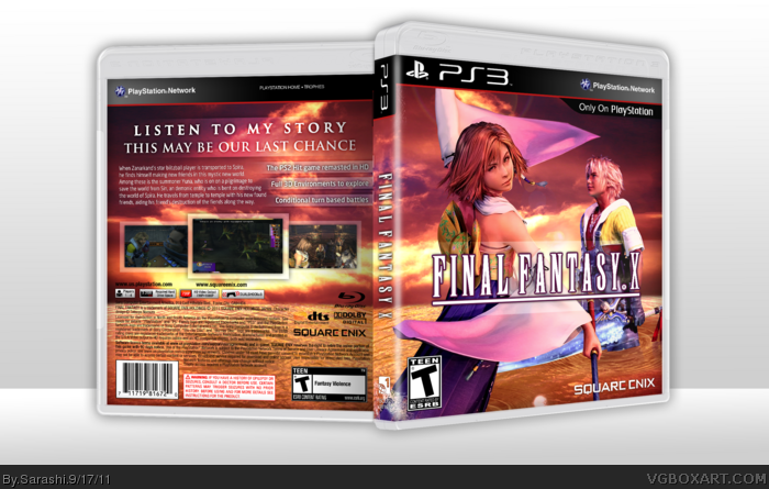
Okay. The color scheme is good and the box is clean, but i wouldnt buy it. it is too plain for FF if that's even possible. It's not like the standard white plain. it is empty. You should change the legal info to black. I dont mind the logo being white, but the box needs other elements. like characters and stuff like that. Like one or two others is fine. But just seems too...i can't find the word. I can see the work, but i dont really like it.
I love the coloration, serene in a way, and you edited the characters appropriately to fit it. The only standing issue I have with the front, is how Tidus' leg stands in the water, it's inconsistent with the ripples.
I don't have an issue with it being too plain, myself, considering FFX's official cover wasn't exactly aesthetically complex. The back layout is basic, but it works. I should mention that the legal information could be inverted, since it's near impossible to read right now.
I think the artwork looks good, but the clash of colors is kinda distracting, especially on the front. As for the back, I like the overall layout but the text could use a little work (Font-wise).
 Final Fantasy X Box Cover Comments
Credit to Sens for the 3D template.
You know, I love this game, less than XIII, but more than the others. I really hope I did this game justice.
[ Reply ]
Okay. The color scheme is good and the box is clean, but i wouldnt buy it. it is too plain for FF if that's even possible. It's not like the standard white plain. it is empty. You should change the legal info to black. I dont mind the logo being white, but the box needs other elements. like characters and stuff like that. Like one or two others is fine. But just seems too...i can't find the word. I can see the work, but i dont really like it.
[ Reply ]
I like it! =D great job! ^_^
[ Reply ]
I love the coloration, serene in a way, and you edited the characters appropriately to fit it. The only standing issue I have with the front, is how Tidus' leg stands in the water, it's inconsistent with the ripples.
I don't have an issue with it being too plain, myself, considering FFX's official cover wasn't exactly aesthetically complex. The back layout is basic, but it works. I should mention that the legal information could be inverted, since it's near impossible to read right now.
[ Reply ]
#4, Gotcha. Editing it now.
[ Reply ]
Quite nice, but not too flashy
Edited at 1 decade ago
[ Reply ]
Looks awesome.
[ Reply ]
I really like how clean this is. I never liked FFX but I do like this :D
[ Reply ]
LOOK good
[ Reply ]
I think the artwork looks good, but the clash of colors is kinda distracting, especially on the front. As for the back, I like the overall layout but the text could use a little work (Font-wise).
[ Reply ]
Nice, I think it matches the game.
Edited at 1 decade ago
[ Reply ]
GOD Amazing
[ Reply ]