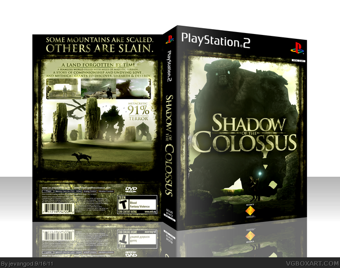
As sd2833 said, I think this may be your best work so far, even though there's still things I don't like. The legal info, as well as the websites URLs, are hard to read in some parts due to the light colors on some parts of the background it is above of. The horse on the back could use some blur, to make it looks in running with speed. The DVD ROM logo looks kinda out of place (Talking about its place on the horizontal part), I'd suggest you put it aligned to the left or right, o even centered, as its palcement is kinda random now. I'm also disliking that tint you put on the barcode and the ESRB rating on the back (Also, you only tinted half of the ESRB, for what I'm assuming is was a mistake or something) as well as the lack of ESRB rating on the front and the centered Sony Computer Entertainment logo.
#8, The legal info is in the exact same allignment as the official. The horse isn't running which is why I didn't blur him so much.The tint I didn't really see as a big problem. I had to reduce the size which is why it may be hard to read the legal info on the back. When I upload the printable it should be fine.
Love this! Soft colours and good colour tone combination. Just amazing...
Very small detail criticism: the first screenshot seems to be a bit wider (vertically) compared to the others, so they don't have the same height. But perhaps it's not worth fixing that.
 Shadow of the Colossus Box Cover Comments
Finally finished this up. I hope you guys like it. I really put alot of work into this one.
[ Reply ]
Love it, great work.
[ Reply ]
Praise the lord!
[ Reply ]
Shit, son.
[ Reply ]
Wow, incredible.
[ Reply ]
Possibly your best.
[ Reply ]
Love it. Breathtaking.
[ Reply ]
As sd2833 said, I think this may be your best work so far, even though there's still things I don't like. The legal info, as well as the websites URLs, are hard to read in some parts due to the light colors on some parts of the background it is above of. The horse on the back could use some blur, to make it looks in running with speed. The DVD ROM logo looks kinda out of place (Talking about its place on the horizontal part), I'd suggest you put it aligned to the left or right, o even centered, as its palcement is kinda random now. I'm also disliking that tint you put on the barcode and the ESRB rating on the back (Also, you only tinted half of the ESRB, for what I'm assuming is was a mistake or something) as well as the lack of ESRB rating on the front and the centered Sony Computer Entertainment logo.
Nevrtheless, this may be your best.
[ Reply ]
#8, The legal info is in the exact same allignment as the official. The horse isn't running which is why I didn't blur him so much.The tint I didn't really see as a big problem. I had to reduce the size which is why it may be hard to read the legal info on the back. When I upload the printable it should be fine.
[ Reply ]
Love this! Soft colours and good colour tone combination. Just amazing...
Very small detail criticism: the first screenshot seems to be a bit wider (vertically) compared to the others, so they don't have the same height. But perhaps it's not worth fixing that.
Edited at 1 decade ago
[ Reply ]
#10, this.
[ Reply ]
PRINTABLE ADDED!
[ Reply ]
Undoubtably the best back design you've produced.
[ Reply ]
MW nao.
[ Reply ]
This box makes me wish I played the game. Good thing they are remaking them in HD. Great work jevangod, you never cease to amaze me.
[ Reply ]
#15, If I only had a PS3.
[ Reply ]
That back is one of the coolest things ever, really fantastic job.
[ Reply ]
#17, Thanks. Worked hard on it.
[ Reply ]
Pretty cool.
[ Reply ]
About damn time! Congrats man!
[ Reply ]
Well, damn! Congrats on the HOF!
Edited at 1 decade ago
[ Reply ]