The front is not that bad, the pink hue is quite odd, but it fits the movie pretty well. The back however, needs a lot of work. It looks unappealing and cluttered.
Too simple, man. And the back does need a lot of work. I get you have a..."robot" almost computer like font, but it really doesn't fit. I would do something on the back besides just text. Have fun with it.
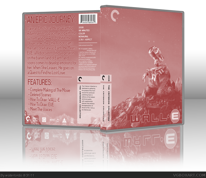
 WALL-E Box Cover Comments
Here it Is :D I wanted to try something a little different :P I used Photoshop for this One , Loll ;D
AND P.S. THIS IS MY 50th BOX :DDD
Edited at 1 decade ago
[ Reply ]
Very Minimal. Very Cool. Awesome job!
[ Reply ]
#2, Thanks!
[ Reply ]
Besides the blurriness, this is good.
[ Reply ]
#4, Yeah sorry about that, it was the only way it would fit onto the template :( It was my first time Skewing in Photoshop xD
[ Reply ]
The front is not that bad, the pink hue is quite odd, but it fits the movie pretty well. The back however, needs a lot of work. It looks unappealing and cluttered.
[ Reply ]
Too simple, man. And the back does need a lot of work. I get you have a..."robot" almost computer like font, but it really doesn't fit. I would do something on the back besides just text. Have fun with it.
[ Reply ]