Once again, your cover is the same. Repetitive. The errors are the same of the older boxes. you don't get better, you just upload printable covers that have too much saturated colors, you don't use the right fonts, you use always the same presentation for the images and you don't use any introducing-description-title. Also, you use logos on the back.
Well, it's a bit better than the AC box, but I have to agree with the comment above, You should use different fonts and design styles. otherwise every box looks come out of a collection, which obviously ain't? There all totally different games.
so, listen to the criticism you get, and actually do something with it.
That's the only way you could improve, as a box artist.
#1 "Errors"???? maybe for you, but I don´t think so. This is a covers collection and this is the reason because they are similar. Thanks anyway I´ll try to be better. And thanks too #2.
You made a collection with logos on the back. They're useless. Your colors are saturated way too much. They could look similiar, but please, if you see imperfections don't say you're doing it wrong because of the collection. It's since three times I'm saying you not to use logos on the back. But, if they are errors just for me, then collect your "errors".
I bet he won't listen, because he hasn't made any changes since I and you have made some suggestions,
to improve his boxes. I guess he doesn't really need constructive criticism? or doesn't really give a shit :/
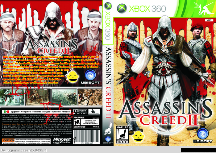
 Assassin's Creed II Box Cover Comments
Once again, your cover is the same. Repetitive. The errors are the same of the older boxes. you don't get better, you just upload printable covers that have too much saturated colors, you don't use the right fonts, you use always the same presentation for the images and you don't use any introducing-description-title. Also, you use logos on the back.
[ Reply ]
Well, it's a bit better than the AC box, but I have to agree with the comment above, You should use different fonts and design styles. otherwise every box looks come out of a collection, which obviously ain't? There all totally different games.
so, listen to the criticism you get, and actually do something with it.
That's the only way you could improve, as a box artist.
Edited at 1 decade ago
[ Reply ]
#1 "Errors"???? maybe for you, but I don´t think so. This is a covers collection and this is the reason because they are similar. Thanks anyway I´ll try to be better. And thanks too #2.
[ Reply ]
You made a collection with logos on the back. They're useless. Your colors are saturated way too much. They could look similiar, but please, if you see imperfections don't say you're doing it wrong because of the collection. It's since three times I'm saying you not to use logos on the back. But, if they are errors just for me, then collect your "errors".
[ Reply ]
"But, if they are errors just for me, then collect your "errors"."
Epic Quote :)
Edited at 1 decade ago
[ Reply ]
Thanks. Anyway, this wasn't intended to offend anyone, it was intended to make the authoe open his eyes.
Edited at 1 decade ago
[ Reply ]
#6, Yeah, I know ;) still epic.
I bet he won't listen, because he hasn't made any changes since I and you have made some suggestions,
to improve his boxes. I guess he doesn't really need constructive criticism? or doesn't really give a shit :/
Edited at 1 decade ago
[ Reply ]
Maybe. But you know, if he won't improve, people will start getting bored of his boxes. And that's more significant than constructive criticism.
[ Reply ]
#8, Well, considering it as some sort of spam.
[ Reply ]
Am I spamming? In that case, I'll stop right now.
Edited at 1 decade ago
[ Reply ]
#10, No I didn't meant you, I meant his boxes, off course ;)
[ Reply ]
Ah ok.
[ Reply ]