Pretty Nice first. And Welcome to the Site! I can see you have a lot of potential and will be a great addition to the site! The Back looks great , but the front needs some work: Try making the renders fit more into the background. And Avoid making renders "float" (: Other than that , This looks Great ! :D
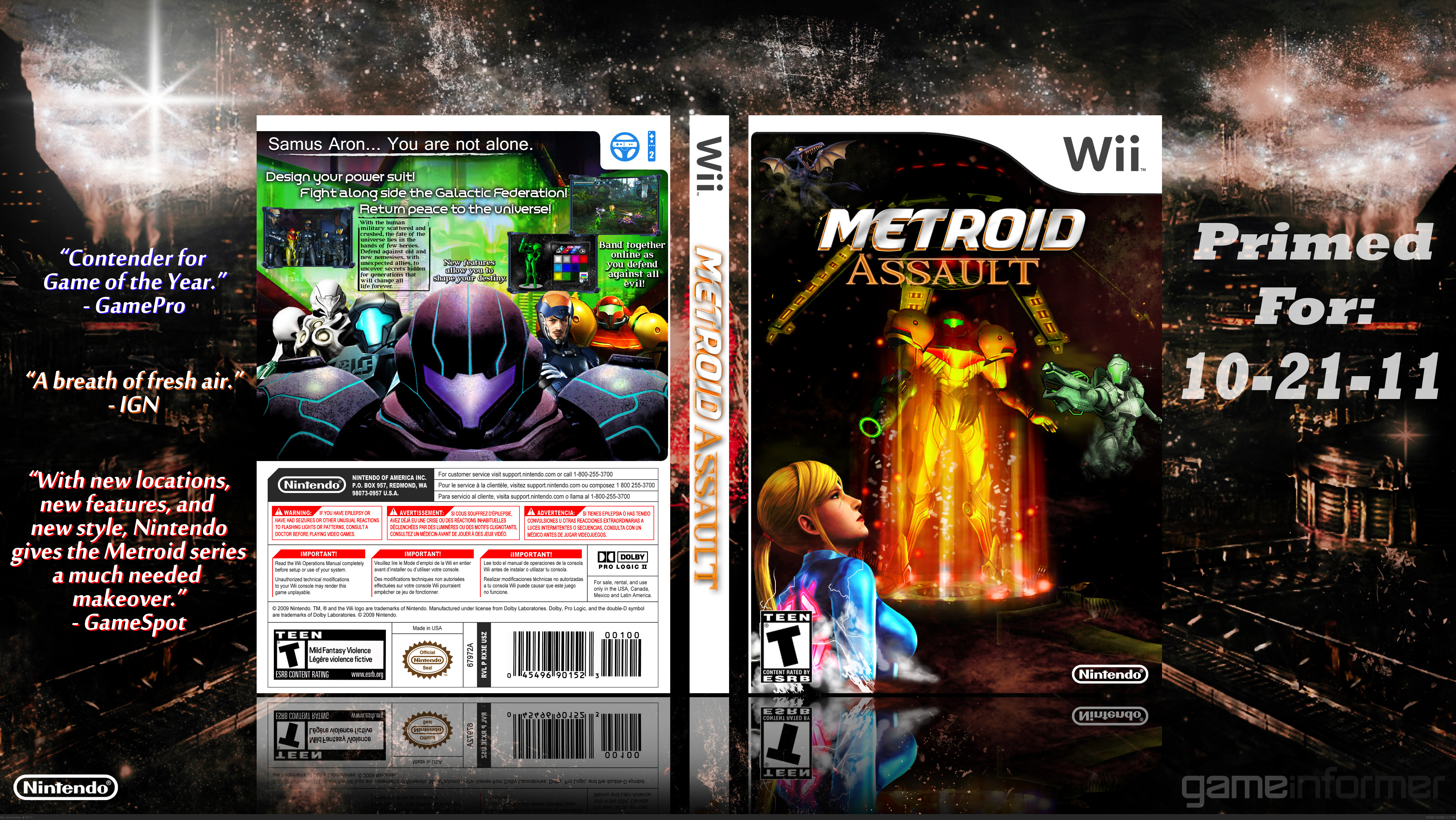
Continuity and canonical accuracy are, somewhat sadly, important to me when it comes to Metroid covers.
Going off that basis, the mixture of imagery randing from Other M to Prime 3 is troubling. Not only for the reason stated before, but because it's difficult to mix art styles and maintain a cohesive, believable design.
Adjustments to color and lighting are necessary, otherwise it's obvious the images came from different sources. For example, the image of Samus in the PED suit is prominently purple in color, yet the characters behind her vary in lighting.
The layout itself is not bad, but the elements within it need some fine tuning.
It's not that bad, for a first. Let me add some to sd1833's stuff though: you should remove the white/green-guy on the front and one of the two Samuses (how the h*ll do you wright Samus in plural? xD) since it looks a little weird with two of the same characters, don't you think?
Also: are you sure this game is supposed to be played with the Wii-wheel? ;D Put a wiimote+nunchuck-logo there instead. :)
Lol maybe it is a new feature, you never know. jk But I have actually never played a Metroid game. So this was somewhat difficult, finding a theme, characters, etc.
 Metroid Assault Box Cover Comments
Pretty Nice first. And Welcome to the Site! I can see you have a lot of potential and will be a great addition to the site! The Back looks great , but the front needs some work: Try making the renders fit more into the background. And Avoid making renders "float" (: Other than that , This looks Great ! :D
[ Reply ]
This is some cool stuff right here.
[ Reply ]
Continuity and canonical accuracy are, somewhat sadly, important to me when it comes to Metroid covers.
Going off that basis, the mixture of imagery randing from Other M to Prime 3 is troubling. Not only for the reason stated before, but because it's difficult to mix art styles and maintain a cohesive, believable design.
Adjustments to color and lighting are necessary, otherwise it's obvious the images came from different sources. For example, the image of Samus in the PED suit is prominently purple in color, yet the characters behind her vary in lighting.
The layout itself is not bad, but the elements within it need some fine tuning.
[ Reply ]
Everything is pretty blurry and unorganized. It simply isn't aesthetically pleasing.
[ Reply ]
It's not that bad, for a first. Let me add some to sd1833's stuff though: you should remove the white/green-guy on the front and one of the two Samuses (how the h*ll do you wright Samus in plural? xD) since it looks a little weird with two of the same characters, don't you think?
Also: are you sure this game is supposed to be played with the Wii-wheel? ;D Put a wiimote+nunchuck-logo there instead. :)
Keep up the good work, and hang in there!
[ Reply ]
Lol maybe it is a new feature, you never know. jk But I have actually never played a Metroid game. So this was somewhat difficult, finding a theme, characters, etc.
[ Reply ]