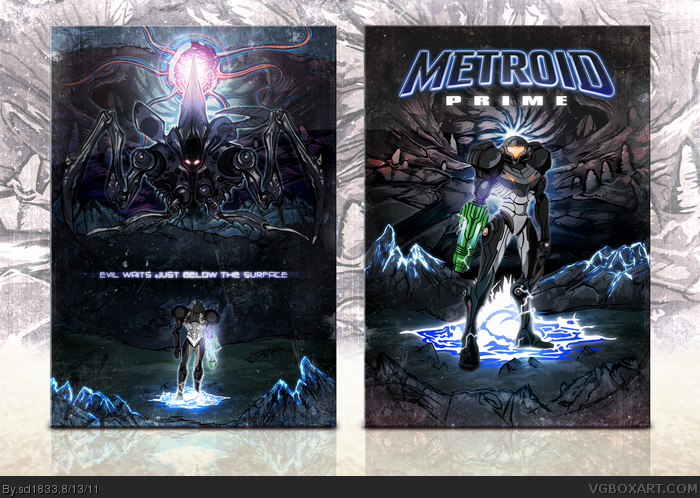
Metroid Prime. Never has a game so brilliantly weaved its base elements into the most immersive and atmospheric experiences I've had the pleasure of enjoying. From the uniquely controlled yet easily mastered combat system, to the finely crafted story told subtly through scans and lore, to the dark, atmospheric world of Tallon IV. In my eyes, Metroid Prime is the peak of the gaming industries' efforts. I doubt I'll ever play another game like this again.
I've wanted to make a cover for this game since I joined, but my skills have restricted me from doing so properly. I still haven't done it justice, I don't feel that possible, but I sure enjoyed trying. Everything you see here, save the logo, is was made by hand. I used what's essentially the same method as I used before to make my Metroid Fusion cover, although I went beyond that in a few cases. It really was a hell of a lot of effort, but I feel it was worth it.
The point of this specific design was two-fold: (1) I simply wanted to do something different, and I'm sure a portrayal of Samus' confrontation with Metroid Prime hasn't been done before. (2) I wanted to mirror the original cover of Prime. In it, Samus is holds a similar pose, in the Varia Suit (starter equipment), standing in a hallway of Frigate Orpheon (the starting area of the game). In my cover, she's standing equipped with the Phazon Suit (final upgrade) and Phazon Beam (final weapon), within the Impact Crater, or final area.
Metroid was what got me into gaming, and I feel I must thank Nintendo for giving us such a wonderful series to enjoy. Happy birthday, Samus.
Tl;dr – Metroid is awesome and I made this by hand (with the exception of the logo).
Thanks guys, it means a good deal to see feedback so quickly.
I actually do have a back planned, but I couldn't have it finished in time. I know exactly what I'm doing with it, but I'm not sure when it'll be finished.
This is completely amazing. Looks just too awesome. I'd like a back, too. The only thing I dislike is the blue color of the logo. This made me loose the ability to make complex sentences. Amazing job, again.
P.S.: I was thinking about enetering the themes of the month too, but now there's no way.
That gloss effect is just killing me, but this is incredible, and easily your finest work to date. I can see how much love and effort has gone into this, bravo!
If you made this all by hand then DAMN..this is amazing. The only thing I kinda dislike is that it looks like the main character is floating, maybe you should add a shadow. Otherwise, this looks great.
#9-11: Thank you. That was my intention in recreating the artwork. I wanted a cleaner, sleeker style.
#12: A back is coming, but I can't make any promises. It probably won't be too soon.
#13: I'll try adding a subtle shadow beneath Samus once I update with a back. Thank you kindly.
#14-17: Thanks guys.
#18: Thanks Tim. I'm actually working on it right now, but I have no idea when it'll actually be finished. I just hope I can bring the idea I have to fruition.
#19: I might tone them down in the printable after uploading the back. Thanks man.
It would be awesome if you turned it into a Metroid Prime animated series or something though, like an anime. The artstyle is just so fitting for that.
#21: After having read your comment, and looking back on the design, it does sort of look like the cover for a Metroid anime. I don't think something like that would work well for this series, but it's an interesting idea nonetheless.
Thanks for dropping by with a comment and compliment. I appreciate it.
This has some very awesome custom artwork, and it fits the series really well. I do agree with Loosejuice about the scanlines, but other than that I love this.
Looking at your first boxes I must say you have excelled tremendously!! I don't know why I have never author faved you hhaaha. I love custom work; GREAT JOB!
Okay, I had to cut down on the presentation to meet the ridiculous 6mb update limit.
The back is finally finished. As you can obviously see, it's essentially the front image, but from behind (or from) Samus' perspective. The spider-like creature is Metroid Prime, and the tentacled organism behind is it's Core Essence. (link) (link)
Again, I used the same methods to recreate and design the artwork in a cleaner, sharper style (and in high resolution). The back is much simpler than the front, but I think I was able to achieve what I wanted.
Feedback is always appreciated, and I do appreciate what I've already recieved. Thanks everyone.
That is genius. I'm not too sure about the reasoning behind changing the contrast so drastically on the front (you had a perfect balance before, IMO,) but dat back...dat back...
#39: Really? It was a pretty minor adjustment on my side (maybe a few notches up on contrast and saturation), but I could undo it if you think it's necessary.
Orgasmic. I really like the concept of having the front a frontal view of Samus, and the back a back. The environmental art is spot-on! You have a lot of skill SD
After comparing my original submission with the update, I did notice the lighting differences were pretty drastic. I decided to update a third time with a brighter front, more akin to what I had before.
I also added a printable with the spine added and gloss removed.
I never expected this much attention. I just wish more people had contributed to the Metroid theme as well.
I must say, think I like the back even better. The creature is so fantastic and glorious. I hope for the day that I will be able to create a piece like this. I don't think I'm very good at drawing on paper by hand, so if you have any suggestions on how I could work towards creating detailed custom art like this that would be great.
This is truly amazing, particularly the back. You need to fix the Phazon on the front (it is way better on the back).
And the logo doesn't fit at all, it reminds too much the original Other M one.
Man, this is really something special. Such clean, high quality, images. Seriously fantastic job. The hard shading style you've used reminds me of "anime Metroid," which I'm not saying is a bad thing, it's just noteworthy.
#51: I doubt I have the skill to create these completely from scratch either. The images (or most of them) derive from old concept artwork and storyboards, which were far too small to be useful. A few of the images were pieced together from various sources and then recreated.
#52: What's the problem with the Phazon on the front? And I chose to use the Other M logo as I felt it fit this style better than Prime's.
#53: I'm glad to hear that. Stupid as it may be, I've always wanted to create a cover that was up to your standards. Thanks for the compliment, and I see what you mean about "anime Metroid".
#54-56: Again, it's greatly appreciated guys. I'm happy to have such strong, continued support.
#57, I think The Phazon on the back looks smoother, maybe it is just me. Don't get me wrong it looks fantastic.
For the the logo, it's just because I've made a custom one based on MP1 for my collection but I didn't use it. And I think it could look good on your front artwork. If you want to take a look on it sometime.
 Metroid Prime Box Cover Comments
Metroid Prime. Never has a game so brilliantly weaved its base elements into the most immersive and atmospheric experiences I've had the pleasure of enjoying. From the uniquely controlled yet easily mastered combat system, to the finely crafted story told subtly through scans and lore, to the dark, atmospheric world of Tallon IV. In my eyes, Metroid Prime is the peak of the gaming industries' efforts. I doubt I'll ever play another game like this again.
I've wanted to make a cover for this game since I joined, but my skills have restricted me from doing so properly. I still haven't done it justice, I don't feel that possible, but I sure enjoyed trying. Everything you see here, save the logo, is was made by hand. I used what's essentially the same method as I used before to make my Metroid Fusion cover, although I went beyond that in a few cases. It really was a hell of a lot of effort, but I feel it was worth it.
The point of this specific design was two-fold: (1) I simply wanted to do something different, and I'm sure a portrayal of Samus' confrontation with Metroid Prime hasn't been done before. (2) I wanted to mirror the original cover of Prime. In it, Samus is holds a similar pose, in the Varia Suit (starter equipment), standing in a hallway of Frigate Orpheon (the starting area of the game). In my cover, she's standing equipped with the Phazon Suit (final upgrade) and Phazon Beam (final weapon), within the Impact Crater, or final area.
Metroid was what got me into gaming, and I feel I must thank Nintendo for giving us such a wonderful series to enjoy. Happy birthday, Samus.
Tl;dr – Metroid is awesome and I made this by hand (with the exception of the logo).
[ Reply ]
I'm really wanting to see a back, since that front image is so amazing. It would make an incredible poster as well. You've outdone yourself with this.
[ Reply ]
This is awesome. I love looking at it.
[ Reply ]
This is amazing, I can see you winning with this.
[ Reply ]
Bro this is amazing! A back would win you the internet..
[ Reply ]
Thanks guys, it means a good deal to see feedback so quickly.
I actually do have a back planned, but I couldn't have it finished in time. I know exactly what I'm doing with it, but I'm not sure when it'll be finished.
[ Reply ]
This is completely amazing. Looks just too awesome. I'd like a back, too. The only thing I dislike is the blue color of the logo. This made me loose the ability to make complex sentences. Amazing job, again.
P.S.: I was thinking about enetering the themes of the month too, but now there's no way.
[ Reply ]
#7: What color would you have the logo be? I felt blue was most fitting with the theme I had.
[ Reply ]
That gloss effect is just killing me, but this is incredible, and easily your finest work to date. I can see how much love and effort has gone into this, bravo!
[ Reply ]
I think you and I should make some sweet love together.
The presentation reminds me of a comic book based on its artstyle.
[ Reply ]
#10, Yes, that's exactly what I was thinking. The thick strokes on the background almost give it a sumi-e type of feel.
[ Reply ]
No back?
[ Reply ]
If you made this all by hand then DAMN..this is amazing. The only thing I kinda dislike is that it looks like the main character is floating, maybe you should add a shadow. Otherwise, this looks great.
Oh, and add a back! Can't wait to see it.
[ Reply ]
oh my.
[ Reply ]
Wow. This is absolutely amazing.
[ Reply ]
Simple, yet stunning.
[ Reply ]
Geez. You took awesome to a whole 'nother level.
[ Reply ]
I wish I could fav this again once you get the back on this done. Glad to hear one's on the way!
[ Reply ]
I really don't like the scanlines on the spine but other than that I applaud your effort.
Edited at 1 decade ago
[ Reply ]
#9-11: Thank you. That was my intention in recreating the artwork. I wanted a cleaner, sleeker style.
#12: A back is coming, but I can't make any promises. It probably won't be too soon.
#13: I'll try adding a subtle shadow beneath Samus once I update with a back. Thank you kindly.
#14-17: Thanks guys.
#18: Thanks Tim. I'm actually working on it right now, but I have no idea when it'll actually be finished. I just hope I can bring the idea I have to fruition.
#19: I might tone them down in the printable after uploading the back. Thanks man.
I'm happy to see my efforts paid off. :D
Edited at 1 decade ago
[ Reply ]
It's great man. Pretty awesome.
It would be awesome if you turned it into a Metroid Prime animated series or something though, like an anime. The artstyle is just so fitting for that.
Great job!
[ Reply ]
#21: After having read your comment, and looking back on the design, it does sort of look like the cover for a Metroid anime. I don't think something like that would work well for this series, but it's an interesting idea nonetheless.
Thanks for dropping by with a comment and compliment. I appreciate it.
Edited at 1 decade ago
[ Reply ]
Outstanding!!! Looking for the back, man!
[ Reply ]
That is one keen box.
I wouldn't even thing to going to the stretch you went to wish your series happy birthday.
[ Reply ]
I herd u leik Metroid.
Freaking amazing,but I would love a back
[ Reply ]
I've looked and I legitimately cannot find anything I dislike about this box. Fantastic.
[ Reply ]
If you're planning on making a back btw, I'd probably remove the gloss effect, or just lower the opacity a bit. It's a tad distracting atm.
[ Reply ]
Beautiful. A back would be awesome.
[ Reply ]
so did you draw this and color in photoshop? simply amazing
[ Reply ]
This has some very awesome custom artwork, and it fits the series really well. I do agree with Loosejuice about the scanlines, but other than that I love this.
[ Reply ]
Looking at your first boxes I must say you have excelled tremendously!! I don't know why I have never author faved you hhaaha. I love custom work; GREAT JOB!
[ Reply ]
Congrats on the HOF! it deserves the fame.
now make a back and get this into MW ;)
[ Reply ]
Thanks everyone for such strong support. Here's to hoping the back is good enough to follow the front.
#27: Yeah, I didn't lower the opacity enough before uploading. It'll be fixed when I [eventually] post the back.
#29: I used the same technique as with my Fusion cover. Also similarly to what Mariolee is/was doing with his Ocarina of Time cover.
#32: I doubt that'll happen but I appreciate the kind words. Thank you.
[ Reply ]
It's pretty exceptional work, I hope that back gets made eventually.
Edited at 1 decade ago
[ Reply ]
Sweet box man. And they say boxes aren't getting any attention. ;D
[ Reply ]
the box is good, the presentation is better +fav
[ Reply ]
#35, Definitely less than usual. This would have made masterworks in a couple days when the site was more active
Anyways, I think it goes without saying that this box is a masterpiece. Fantastic work, SD.
[ Reply ]
Okay, I had to cut down on the presentation to meet the ridiculous 6mb update limit.
The back is finally finished. As you can obviously see, it's essentially the front image, but from behind (or from) Samus' perspective. The spider-like creature is Metroid Prime, and the tentacled organism behind is it's Core Essence. (link) (link)
Again, I used the same methods to recreate and design the artwork in a cleaner, sharper style (and in high resolution). The back is much simpler than the front, but I think I was able to achieve what I wanted.
Feedback is always appreciated, and I do appreciate what I've already recieved. Thanks everyone.
[ Reply ]
That is genius. I'm not too sure about the reasoning behind changing the contrast so drastically on the front (you had a perfect balance before, IMO,) but dat back...dat back...
[ Reply ]
Holy --
[ Reply ]
Thanks for the fast response, guys.
#39: Really? It was a pretty minor adjustment on my side (maybe a few notches up on contrast and saturation), but I could undo it if you think it's necessary.
#40: I take it that's a good thing?
[ Reply ]
#40, Yes, a VERY good thing.
[ Reply ]
Orgasmic. I really like the concept of having the front a frontal view of Samus, and the back a back. The environmental art is spot-on! You have a lot of skill SD
[ Reply ]
Wow! if I only could fave this again ;)
We've got an 'M'.......We've got a 'K', MASTERWORK! lol
Edited at 1 decade ago
[ Reply ]
frickin sick yo. I actually think it would look even better with no text on the back.
And i agree with flexx, you didnt need to tweak anything on the front, besides the gloss and adding a little shadow
Edited at 1 decade ago
[ Reply ]
After comparing my original submission with the update, I did notice the lighting differences were pretty drastic. I decided to update a third time with a brighter front, more akin to what I had before.
I also added a printable with the spine added and gloss removed.
I never expected this much attention. I just wish more people had contributed to the Metroid theme as well.
[ Reply ]
Wow. Too bad I can't fav again :(
[ Reply ]
Looks much better than version 2.. Damn, I seriously cannot stop staring at this
[ Reply ]
This is perhaps the best thing my eyes have laid upon.
[ Reply ]
I just had to comment again to say wow.
[ Reply ]
I must say, think I like the back even better. The creature is so fantastic and glorious. I hope for the day that I will be able to create a piece like this. I don't think I'm very good at drawing on paper by hand, so if you have any suggestions on how I could work towards creating detailed custom art like this that would be great.
Edited at 1 decade ago
[ Reply ]
This is truly amazing, particularly the back. You need to fix the Phazon on the front (it is way better on the back).
And the logo doesn't fit at all, it reminds too much the original Other M one.
Edited at 1 decade ago
[ Reply ]
Man, this is really something special. Such clean, high quality, images. Seriously fantastic job. The hard shading style you've used reminds me of "anime Metroid," which I'm not saying is a bad thing, it's just noteworthy.
Great, great, job. Favorited.
[ Reply ]
Definitely deserved MasterWorks. Congrats.
[ Reply ]
Congrats on the HOF!
really deserves it, because this is some really tight,
custom art you've made there, it's awesome!
[ Reply ]
Holy shit, dude! link
#55, It's MW, man. :D
Edited at 1 decade ago
[ Reply ]
#47-50: Thanks, you're too kind.
#51: I doubt I have the skill to create these completely from scratch either. The images (or most of them) derive from old concept artwork and storyboards, which were far too small to be useful. A few of the images were pieced together from various sources and then recreated.
#52: What's the problem with the Phazon on the front? And I chose to use the Other M logo as I felt it fit this style better than Prime's.
#53: I'm glad to hear that. Stupid as it may be, I've always wanted to create a cover that was up to your standards. Thanks for the compliment, and I see what you mean about "anime Metroid".
#54-56: Again, it's greatly appreciated guys. I'm happy to have such strong, continued support.
Thanks for the MW entry guys. :D
[ Reply ]
#56, Way to excited, so I typed 'HOF' instead of 'MW' :/
[ Reply ]
#57, I think The Phazon on the back looks smoother, maybe it is just me. Don't get me wrong it looks fantastic.
For the the logo, it's just because I've made a custom one based on MP1 for my collection but I didn't use it. And I think it could look good on your front artwork. If you want to take a look on it sometime.
Edited at 1 decade ago
[ Reply ]
#59: Interesting. Send the logo my way and I'll have a look at it. Thanks for the constructive criticism.
[ Reply ]
I wanna fav again
[ Reply ]
How have I not seen this before? I remember you asking for advice on this, but man, it really didn't look like you needed it.
[ Reply ]