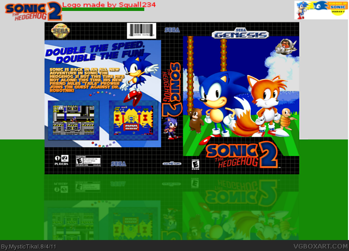
[ Box updated on August 4th, 2011 ] [ original ]
 Sonic the Hedgehog: 2 Box Cover Comments
Comment on MysticTikal's Sonic the Hedgehog: 2 Box Art / Cover.

[ Box updated on August 4th, 2011 ] [ original ]
Comment on MysticTikal's Sonic the Hedgehog: 2 Box Art / Cover.
Finally DONE! My entry for the SoS 2011 Comp.
Credits-
Stevencho
Sonic News Network
Mystical Forest Zone
Sonic Retro.
[ Reply ]
Awesome! ;)
I would center Sonic and Tails though.
[ Reply ]
#2, I agree, center them.
about the back font (it fits the game) but the alignment is to far to the left,
move the header and the body text a bit to the right, so it doesn't look like,
it's almost falling of the template ;)
and tone the green a bit down on the render, it doesn't look very good.
A great entry to the SOS Competition, good luck.
Edited at 1 decade ago
[ Reply ]
Updated. I tried to redo the things Bastart and twoxT told me. Hope I did.
Good luck to everyone in the competition!
[ Reply ]
#4, It looks definitely better!
The green still looks weird on the render,
but if you like it, keep it this way.
Edited at 1 decade ago
[ Reply ]
Aaaah, much better.
[ Reply ]
My only complaints are the seven emeralds under the screenshots. And the sprite on the spine. Both of which are bland and distracting. And the design and idea are cliche, not so much the back, but the front is a ton.
Anyway, Good luck in the Competition! +fav
[ Reply ]
This good. I like it a lot. I would move the render down a bit on the spine, and the reflection is off a bit on the front. Just a bit.
Good luck in the competition! +fav
[ Reply ]