This is my entry to the VGBA Cup - Round 2 Kickin' it Old School
Thanks to Manuel_Alejandro95 and KoopaDasher for their tips
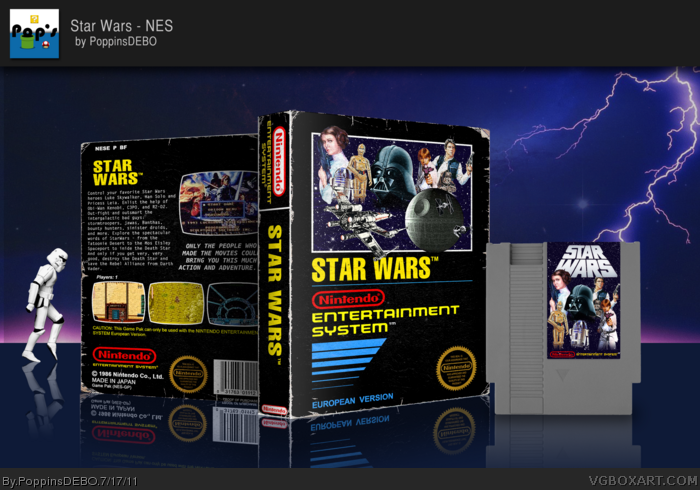
I've been working on this since the beginning, it started as Castlevania, but it was not getting as I wanted, so then it hit my head. Star Wars had an easy artwork, it has been evolving a lot, as you may have watched in the WIP.
I like it a lot :D
Enjoy it, and please watch it at Full View
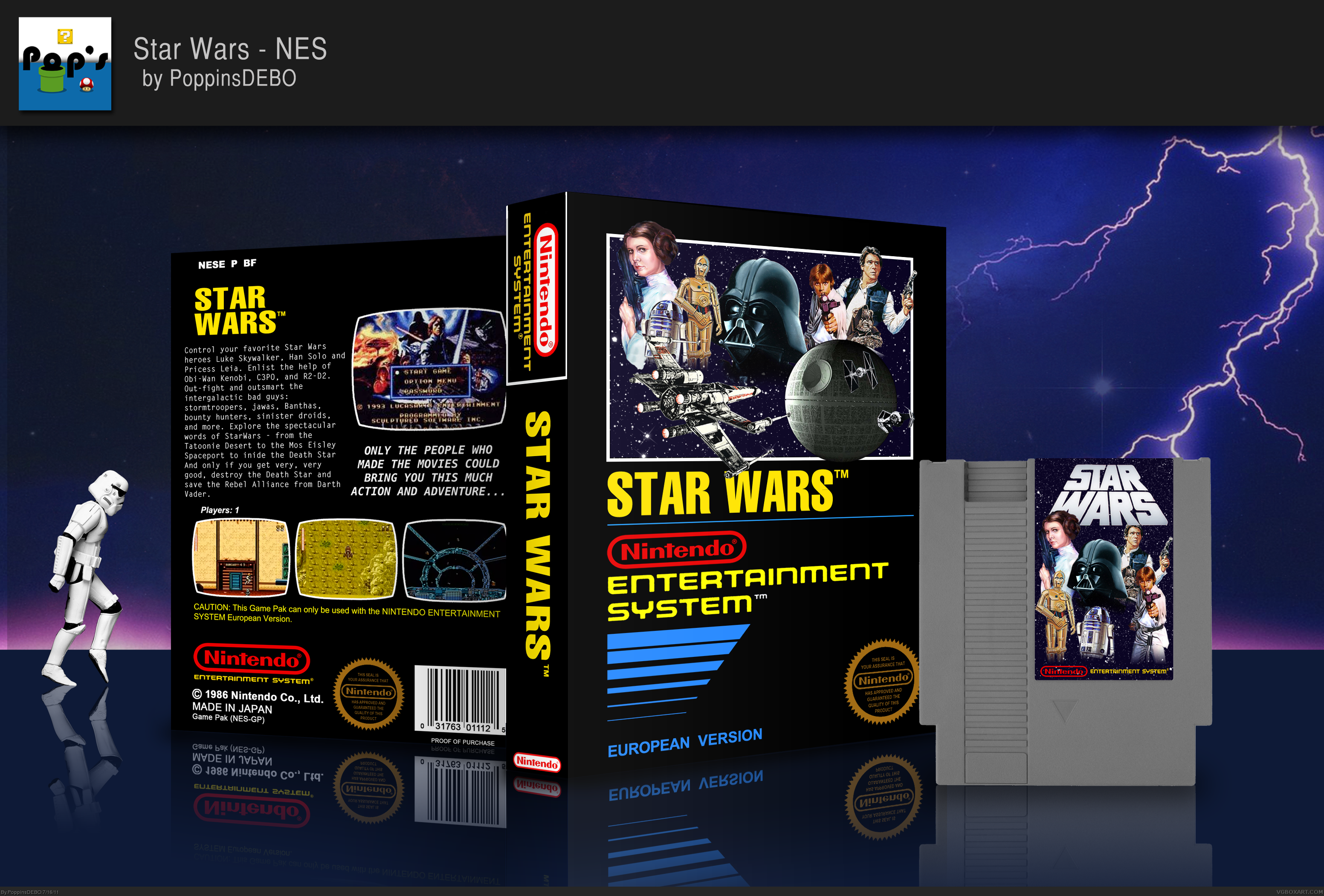
You've done 2 things with this box that helps set it apart from the rest, made some small tweaks to the template, and rearranged the layout to fit the cartridge. Nice job.
Just wonderfully done. I love the template tweak, image arrangement, and the fact that you re-fitted the stuff for the NES cart (I always dislike it when people copy/paste the cover onto a cartridge or disk. What's the point of displaying it in the presentation if it's just going to be a duplicate?)
Great job. This is really going to be a tough round.
Update!
I loved the idea of "damaging" so I did it just like Manuel. I asked him before everything, and even asked for some tips, (Thanks Manuel, a lot). I did it by myself (if you are asking) Thanks!
#14, It looked better without all that damaging. Some covers don't need that, and this was one of them. The damaging looks jaggedy and out of place in my opinion.
I like the update! The rearranging of characters is quite nice and looks like something I could have seen way back when.
#13, I believe it is just that the title is not slanted, and 'entertainment system' is not next to 'nintendo.' Just small stuff like that.
 Star Wars Box Cover Comments
This is my entry to the VGBA Cup - Round 2 Kickin' it Old School
Thanks to Manuel_Alejandro95 and KoopaDasher for their tips
I've been working on this since the beginning, it started as Castlevania, but it was not getting as I wanted, so then it hit my head. Star Wars had an easy artwork, it has been evolving a lot, as you may have watched in the WIP.
I like it a lot :D
Enjoy it, and please watch it at Full View
Edited at 1 decade ago
[ Reply ]
Nice work, sir. I love the way you've arranged the images. And the template is excellent. Nice presentation as well. Overall, great work.
[ Reply ]
#2, Thanks!
[ Reply ]
Double Post -.-
Edited at 1 decade ago
[ Reply ]
Amazing job here, great work.
[ Reply ]
The force is with you in this box art :P
[ Reply ]
#6, you are my 50th Fav! Thanks!
[ Reply ]
You've done 2 things with this box that helps set it apart from the rest, made some small tweaks to the template, and rearranged the layout to fit the cartridge. Nice job.
[ Reply ]
Rank 4!!!!! Thanks guys
[ Reply ]
is that stormtrooper really moon walkin'? talkin' about ol'skool :)
Nice presentation and overall, a flawless box imo. great job!
[ Reply ]
#10, Yay! Thanks!
[ Reply ]
Just wonderfully done. I love the template tweak, image arrangement, and the fact that you re-fitted the stuff for the NES cart (I always dislike it when people copy/paste the cover onto a cartridge or disk. What's the point of displaying it in the presentation if it's just going to be a duplicate?)
Great job. This is really going to be a tough round.
[ Reply ]
Just wondering, what are the template tweaks everyone's talking about?
[ Reply ]
Update!
I loved the idea of "damaging" so I did it just like Manuel. I asked him before everything, and even asked for some tips, (Thanks Manuel, a lot). I did it by myself (if you are asking) Thanks!
[ Reply ]
#14, It looked better without all that damaging. Some covers don't need that, and this was one of them. The damaging looks jaggedy and out of place in my opinion.
[ Reply ]
I like the update! The rearranging of characters is quite nice and looks like something I could have seen way back when.
#13, I believe it is just that the title is not slanted, and 'entertainment system' is not next to 'nintendo.' Just small stuff like that.
[ Reply ]
#15, I kust want to ask you a question. Did you see it in full view? That is when you can fully appreciate the worn out effect.
[ Reply ]
Wow, this is nice.
[ Reply ]