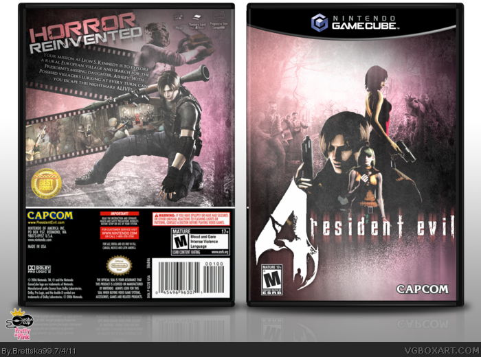
After seeing so many great boxes, I'm bound to be near the bottom of the leaderboards, but it's great to see so many awesome covers :). For Round 1 I wanted to follow the pink theme but still make a dark box, I hope I achieved that. Enjoy!
I like the composition of the back, the front is left to be desired though. The contrast is a bit too heavy on the characters, though I do like the washed out effect.
The film reel downplays the horror element of RE and makes me think Viewtiful Joe or Madworld. But I really dig the subtlety of the pink. Very nice work dude.
I agree with both #2 and #3, but I'm really surprised at how well Pink worked for this. I thought this would bomb horribly, but it actually worked really well.
Not getting the pink, it's not prominent enough. The box is still well made but I don't think it works as far as this round goes. All of the legal stuff on the bottom of the back looks really blurry.
In the front I think you should increase the renders from the center a little bit more and decrease as the renders to fit, put some more contrast and maybe a village background on the back.
But despite all this I said, your box is pretty amazing, suck great design in both sides. =)
 Resident Evil 4 Box Cover Comments
After seeing so many great boxes, I'm bound to be near the bottom of the leaderboards, but it's great to see so many awesome covers :). For Round 1 I wanted to follow the pink theme but still make a dark box, I hope I achieved that. Enjoy!
[ Reply ]
I like the composition of the back, the front is left to be desired though. The contrast is a bit too heavy on the characters, though I do like the washed out effect.
[ Reply ]
The film reel downplays the horror element of RE and makes me think Viewtiful Joe or Madworld. But I really dig the subtlety of the pink. Very nice work dude.
Edited at 1 decade ago
[ Reply ]
I gotta be honest, I'm not really feeling the front, but I love the back. The front just seems to Clichéd for a Resi 4 box art. sorry man
[ Reply ]
I agree with both #2 and #3, but I'm really surprised at how well Pink worked for this. I thought this would bomb horribly, but it actually worked really well.
[ Reply ]
I love this. Especially the front composition- but I just wish that the logo was smaller. That's my only gripe. I love the back as well. Great job!
[ Reply ]
I love the washed out feel of this box. Awesome work all the way through.
[ Reply ]
Not getting the pink, it's not prominent enough. The box is still well made but I don't think it works as far as this round goes. All of the legal stuff on the bottom of the back looks really blurry.
Edited at 1 decade ago
[ Reply ]
#5, The official box had a pink color scheme.
link
I like the front, the back feels a little empty though. I like the overall style though.
[ Reply ]
I like it, RE4 of corse I like it.
wish my RE4 gamecube box was on the front again
[ Reply ]
Crisp, clean, on-point. Nice job dude.
[ Reply ]
The stylish look of the front is pretty amazing.
[ Reply ]
In the front I think you should increase the renders from the center a little bit more and decrease as the renders to fit, put some more contrast and maybe a village background on the back.
But despite all this I said, your box is pretty amazing, suck great design in both sides. =)
[ Reply ]