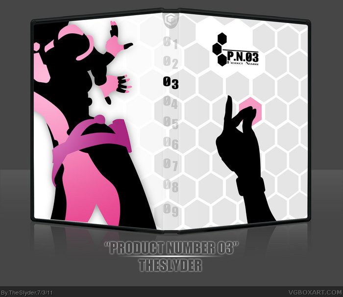
This is my entry for the first round of the annual competition: Pretty in Pink. I felt like Product Number 03 would be an ideal game (I originally wanted to do Viewtiful Joe, then changed it to Final Fantasy X-2, then again when I couldn't find any good ideas for X-2) because the main character is very flamboyantly feminine and sexual in her movement and general style.
Of course, if you expected a standard template with screen shots and commercial emblems from me, you must not be very familiar with my work. As usual, printable is super-duper-high-resolution.
I love the front. There is enough pink to call it the main colour and not enough to make it look forced. It is perfect.
I'm not a big fan of the back, however. I'm gonna be honest, I can't even tell what the silhouette is.
#3, I was worried about that. I was concerned about the cover not being obvious either. I knew what they were because I saw the images prior to "silhouetting" them. I hope you're a minority on this issue.
Gotta love P.N.03, the cover is nice, minimal, but very clever and highly original. It's a simple box that actually gives you sense of the game (if you've played it).
I didn't play much of this game, but I do recognize the pose on the back. I don't know how I feel about it, though. Something about your rendition makes it look like the lower hand (her right?) is broken...
The front has a great feel to it, though I could have used a little more pink.
On your process, I considered Final Fantasy X-2 as well, but figured it was too obvious.
Overall, it's pretty decent, just the back is throwing it for me.
 P.N.03 Box Cover Comments
This is my entry for the first round of the annual competition: Pretty in Pink. I felt like Product Number 03 would be an ideal game (I originally wanted to do Viewtiful Joe, then changed it to Final Fantasy X-2, then again when I couldn't find any good ideas for X-2) because the main character is very flamboyantly feminine and sexual in her movement and general style.
Of course, if you expected a standard template with screen shots and commercial emblems from me, you must not be very familiar with my work. As usual, printable is super-duper-high-resolution.
Edited at 1 decade ago
[ Reply ]
Never heard of it. Looks great though.
[ Reply ]
I love the front. There is enough pink to call it the main colour and not enough to make it look forced. It is perfect.
I'm not a big fan of the back, however. I'm gonna be honest, I can't even tell what the silhouette is.
[ Reply ]
#3, I was worried about that. I was concerned about the cover not being obvious either. I knew what they were because I saw the images prior to "silhouetting" them. I hope you're a minority on this issue.
Here's what it is, though: link
[ Reply ]
I like the color choice and abstract compositional concept
5/5 + fav
[ Reply ]
Gotta love P.N.03, the cover is nice, minimal, but very clever and highly original. It's a simple box that actually gives you sense of the game (if you've played it).
[ Reply ]
Very stylish and aesthetic. Love it!
[ Reply ]
I've never heard of this, but this is an amazing box nonetheless. Very minimal, but I like that. Fantastic job.
[ Reply ]
I didn't play much of this game, but I do recognize the pose on the back. I don't know how I feel about it, though. Something about your rendition makes it look like the lower hand (her right?) is broken...
The front has a great feel to it, though I could have used a little more pink.
On your process, I considered Final Fantasy X-2 as well, but figured it was too obvious.
Overall, it's pretty decent, just the back is throwing it for me.
[ Reply ]
I just really, really like that front and generally dig the entire minimalism.
[ Reply ]
The entire design concept is awesome and the way you implemented the pink too is awesome.
[ Reply ]