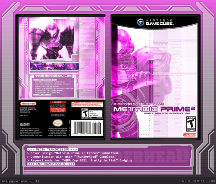
When I first saw that the Round theme was “Pretty in Pink”, I immediately remembered a previous competition I was in where the submissions had to be in Black and White or grayscale. I remembered that for most of the boxes submitted, people seemed to approach the box like a normal design, and then simply drain the design of color. I didn’t want to do that, so I set out to create a design that would use pink in a way that felt natural, like it could be chosen as the cover design and no one would think twice about it.
ThatÂ’s when I saw a screenshot for Metroid Prime 2, taken during a boss battle in the Dark world. The skyline in the screenshot was a bright pink. As I started looking at the concept art for the game, I found a lot of images that used a minimalistic yet technological design style, like computer screens or x-ray results gone bad. I wanted to find a way to use that look in my box, while still showing the dual nature of the game.
I don’t feel comfortable working in the “tech” realm of design at all. It’s not an area I dabble in, and I had none of the patterns and filters that I needed to make the design look believable. I spent a lot of time looking for brushes and patterns that would give me just the right look for what I needed. It was a grueling process, but overall I’m very happy with how the design turned out, especially considering I’ve never really worked with “tech” designs before. Unfortunately, given the resolution of my source images, I am unable to offer a higher resolution image than the full view that you will see here.
Credit to Manuel_Alejandro95 and qwerty334 for the Gamecube template.
I love all the detail you put into this, and your effort really shows. The design itself, while simple, is spectacular. The shades of pink you used also look great.
Beautiful box, though there's things I don't like about it, mostly on the back. The arrangement of the back is rather too simple, considering the "complex" scheme this kind of layout suggests. The screenshots are a bit too tiny for my likeness. Is that text bar at the right of the back supposed to be read? That could've been a nice way of implementing features or something similar. And the "1-4 Players" icon is actually hard to read.
Well, the editings you got here, as well as the use of pattern and textures, and the high-tech vibe are top-notch, but as I already said, there's things I don't like. Great box, nevertheless.
#7, The back is simple because I felt as though adding too much to it would take away from the simplicity of the front. I had considered adding more of the "computer-style" windows to the back... putting them over the other windows, maybe having the actual "distress transmission" closer to the top, with something else in its place at the bottom. But it felt too crowded, and I wanted it to be sleek and simple, not crowded. As for the screenshots, they are tiny because I felt like that would suit the design the best. I wanted to find a way that the screenshots would fit into the design without feeling forced, and having them in this manner made them feel like a part of the design, as though they are clips from a security camera or part of Samus' suit taking notice of her battles.
The text bar on the right is not supposed to be read, it's only for aesthetic purposes. It might have been a good way of putting in more information, but I don't feel that there is that much more information to offer. I don't want to ruin the plot, so other than the fact that there is multiplayer, there's little else to tell. In actuality, the text in that box is the website source code for the Metroid Database site, where I found my images. As for the 1-4 player icon... I didn't intend for it to be there. I guess I forgot to cut it out at the end. Also, I already said why the resolution is so low.
#8, The darker strip was done on purpose. Have you played the game? In the game the corrosive substance "Phazon" rips the very reality of Planet Aether into two segments, a light and a dark half. In the Dark World, Samus' health is constantly depleted, and the enemies are weak only to beams of concentrated light. That's what the bar is... a hint at the plot of the game, without giving it away.
I figured that's why you did the darker stripe, but I personally would have liked to see it as not such a hard stripe. Overall, this has a nice array of elements going on.
My first concept for this was Metroid Prime. I was going to do a yellow/pink halftone motif, but I couldn't get it right. Maybe if I had done some gray elements I could bring it together? Anyway, back to you.
Good to see you making boxes again. Once you knock off that rust from not doing this, I'm sure you'll perform even better than this.
My personal favorite from the entries posted so far. This game just seemed so unlikely to be chosen for a "pink" version of it. It worked out perfectly though. The front has an elegance to it that I absolutely love. The back isn't as good as the front, but it is still very well made, and again I really like it.
People will probably think this color scheme unusual for Metroid, but it works exceptionally well in Prime 2's case. Pinks and purples and a prominent color throughout the game, most notably in Dark Aether. I was hoping someone would take advantage of this fact for the theme.
I clearly see the idea behind the dark strip across the left side, but the reason it's so... distracting, is because of how far off to side/edge it is.
Excellent use of brushes and effects throughout this, though. You've done an excellent job replicating not only sci-fi/tech designs in general, but much of the imagery from Echoes specifically. Exactly how I'd imagine a cover for the game should look.
The back's a continuation of this excellent brushwork. My only qualm (aside from the entire cover being low resolution), is how uncomfortably crammed in that synopsis box is. It could use some more breathing room.
Good work, Thunder. Again you make me envy your skill.
Wow, this is beautiful, Koopa! (I mean, *ahem*, Thunderhead :P)- it is totally deserving of first place. You incorporated the color pink in the design in a way that is very natural, and of course your front and back compositions on this box are excellent as always. Fantastic job man
 Metroid Prime 2: Echoes Box Cover Comments
When I first saw that the Round theme was “Pretty in Pink”, I immediately remembered a previous competition I was in where the submissions had to be in Black and White or grayscale. I remembered that for most of the boxes submitted, people seemed to approach the box like a normal design, and then simply drain the design of color. I didn’t want to do that, so I set out to create a design that would use pink in a way that felt natural, like it could be chosen as the cover design and no one would think twice about it.
ThatÂ’s when I saw a screenshot for Metroid Prime 2, taken during a boss battle in the Dark world. The skyline in the screenshot was a bright pink. As I started looking at the concept art for the game, I found a lot of images that used a minimalistic yet technological design style, like computer screens or x-ray results gone bad. I wanted to find a way to use that look in my box, while still showing the dual nature of the game.
I don’t feel comfortable working in the “tech” realm of design at all. It’s not an area I dabble in, and I had none of the patterns and filters that I needed to make the design look believable. I spent a lot of time looking for brushes and patterns that would give me just the right look for what I needed. It was a grueling process, but overall I’m very happy with how the design turned out, especially considering I’ve never really worked with “tech” designs before. Unfortunately, given the resolution of my source images, I am unable to offer a higher resolution image than the full view that you will see here.
Credit to Manuel_Alejandro95 and qwerty334 for the Gamecube template.
[ Reply ]
Wow, this looks great!
I love all the detail you put into this, and your effort really shows. The design itself, while simple, is spectacular. The shades of pink you used also look great.
[ Reply ]
Nice box, I love it!
[ Reply ]
Gorgeous.
[ Reply ]
That is very pretty.
[ Reply ]
Oh wow. The color scheme actually works.
[ Reply ]
Beautiful box, though there's things I don't like about it, mostly on the back. The arrangement of the back is rather too simple, considering the "complex" scheme this kind of layout suggests. The screenshots are a bit too tiny for my likeness. Is that text bar at the right of the back supposed to be read? That could've been a nice way of implementing features or something similar. And the "1-4 Players" icon is actually hard to read.
Well, the editings you got here, as well as the use of pattern and textures, and the high-tech vibe are top-notch, but as I already said, there's things I don't like. Great box, nevertheless.
[ Reply ]
Love it, although I'm not a big fan of the darker strip on the left hand side of the front.
[ Reply ]
#7, The back is simple because I felt as though adding too much to it would take away from the simplicity of the front. I had considered adding more of the "computer-style" windows to the back... putting them over the other windows, maybe having the actual "distress transmission" closer to the top, with something else in its place at the bottom. But it felt too crowded, and I wanted it to be sleek and simple, not crowded. As for the screenshots, they are tiny because I felt like that would suit the design the best. I wanted to find a way that the screenshots would fit into the design without feeling forced, and having them in this manner made them feel like a part of the design, as though they are clips from a security camera or part of Samus' suit taking notice of her battles.
The text bar on the right is not supposed to be read, it's only for aesthetic purposes. It might have been a good way of putting in more information, but I don't feel that there is that much more information to offer. I don't want to ruin the plot, so other than the fact that there is multiplayer, there's little else to tell. In actuality, the text in that box is the website source code for the Metroid Database site, where I found my images. As for the 1-4 player icon... I didn't intend for it to be there. I guess I forgot to cut it out at the end. Also, I already said why the resolution is so low.
#8, The darker strip was done on purpose. Have you played the game? In the game the corrosive substance "Phazon" rips the very reality of Planet Aether into two segments, a light and a dark half. In the Dark World, Samus' health is constantly depleted, and the enemies are weak only to beams of concentrated light. That's what the bar is... a hint at the plot of the game, without giving it away.
[ Reply ]
...And thus Koopa became a legend once more.
[ Reply ]
Yes. Yes, I think I quite like this.
[ Reply ]
I figured that's why you did the darker stripe, but I personally would have liked to see it as not such a hard stripe. Overall, this has a nice array of elements going on.
My first concept for this was Metroid Prime. I was going to do a yellow/pink halftone motif, but I couldn't get it right. Maybe if I had done some gray elements I could bring it together? Anyway, back to you.
Good to see you making boxes again. Once you knock off that rust from not doing this, I'm sure you'll perform even better than this.
[ Reply ]
My personal favorite from the entries posted so far. This game just seemed so unlikely to be chosen for a "pink" version of it. It worked out perfectly though. The front has an elegance to it that I absolutely love. The back isn't as good as the front, but it is still very well made, and again I really like it.
[ Reply ]
People will probably think this color scheme unusual for Metroid, but it works exceptionally well in Prime 2's case. Pinks and purples and a prominent color throughout the game, most notably in Dark Aether. I was hoping someone would take advantage of this fact for the theme.
I clearly see the idea behind the dark strip across the left side, but the reason it's so... distracting, is because of how far off to side/edge it is.
Excellent use of brushes and effects throughout this, though. You've done an excellent job replicating not only sci-fi/tech designs in general, but much of the imagery from Echoes specifically. Exactly how I'd imagine a cover for the game should look.
The back's a continuation of this excellent brushwork. My only qualm (aside from the entire cover being low resolution), is how uncomfortably crammed in that synopsis box is. It could use some more breathing room.
Good work, Thunder. Again you make me envy your skill.
[ Reply ]
Too much blue
[ Reply ]
#15, I'm seriously asking; are you colorblind?
[ Reply ]
Wow, this is beautiful, Koopa! (I mean, *ahem*, Thunderhead :P)- it is totally deserving of first place. You incorporated the color pink in the design in a way that is very natural, and of course your front and back compositions on this box are excellent as always. Fantastic job man
[ Reply ]
Agreed with the dark strip, but other than that, this is pretty stunning.
[ Reply ]
Congrats on the HOF!
I really like this box, the pink is not overdone,
and the transmission thing at the back is clever.
Edited at 1 decade ago
[ Reply ]
Woah, Samus never looked better..in pink!:D
[ Reply ]