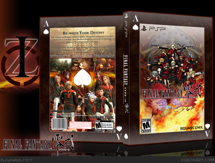
I have to say that i'm in love with this one. So oddly enough Sqaure Enix has a habit of bestowing strange names upon their characters. Because the main characters in this game besides Machina and Rem are named after the sequences in a card deck, I decided to make my box in the image of a card. I picked spade because its my favorite suit. I had some help in the forums and i'd like to give credit to afifan000, Twoxt, Squall234 and Titan38.
I had a lot of fun doing this box, it was a pain to render out some of the characters at the bottom of the back, but it was worth it. This custom template is also one of my favorite parts of the box as well, making it look even more like a card deck. Plus i picked Ace because that is the name of the most frequently shown Class Zero character.
Oh yeah please view in full, because the text on the back is kinda small from here. Hope you like. Plus i also edited the logo to remove the japanese letters on the dress of one of the logo ladies. I put a red stroke around the title of the game on the logo as there isn't one on the original and i wanted it to match the rest of the fabula nova crystallis boxes. Okay I guess that's it.
Is it really rated M? Also, try changing up the center spade on the back, maybe black, or a bright flame effect...or not, it's up to you. This looks great!
This is pretty cool. The front is really nice and I don't see much improvement for it. The back, however, feels to cramped up and low quality in few spots. Also, that big white "leaf" (card symbol, forgot the name) looks out of place and I don't think belongs there.
Thanks Everyone.
#4, I agree with #8. Square Enix has a nasty habit of putting their characters on the back, and they still haven't released enough material for a box as such to be made without the classic FF white.
#5 Thanks. You really think it's cramped? well i actually kinda thought so too. but i think the crampeness fits it. I wanted the characters to be shown well enough so i made way for them. Besides, like i said, there isn't enough material to compose a multi-theme-ish sorta box. The Spade you mean? I put it there to emphasize the card effect. As i said i chose Ace, and the Ace card looks like the back of the box. Otherwise, me putting A on the corners of the box isn't put into effect well.
#6 & #7, Thank you very much. You rock. Besides you both helped out alot.
I actually like the GCI characters on the back, though I agree it's not as stunning as the front is. One thing that bothers me is that the back's black text is closer to the white text than it is from the upper brder; also I think the template would look better If it didn't have that white/gray gradient at the bottom.
#13: it was originally supposed to be black and white gradient behind the smaller section, but i changed my mind but the white gradient thing just wouldn't budge. :)
Um yeah i noticed the text on the back but im not moving it now.
thank you though
#14: Thank you very much. Ya really think so?
I agree that the 2d and 3d between characters on the front and back is a little odd, but it is still really well made. Some places look blurry full view, but that might just be me. Either way, I like it.
[ Also, I think that is my Playstation Network Sprinkle in the card :) ]
What dou you mean by '2nd and 3rd between characters on the front and back'? Where does it look blurry? Thanks a bunch. Haha, no its not actually, i made it myself. but maybe i got the idea from you.
#26, Not 2nd and 3rd, but 2d and 3d. The front is 2d characters, and the back is the 3d CGI. It isn't bad, just something I thought looked odd.
The blurry thing I see is the background on the card, whatever you have there. The opacity is low, but it looks blurry to me, definitely not a big deal, though.
And okay. It doesn't really matter if it was, I was just wondering. I am not a credit wh***, I just like to know when people are able to use my stuff.
Again, i dont' think i'll be doing a printable for this box. It's a little too tall for a psp box. But thank you for wanting one. Makes me feel good to know that you like my box.
Overall I like the look and feel of the box, your presentation is also nice, and I agree with Deathmania on the back text.
But with the way your box looks, it seems to me like it should be a collector's box that the game would go in. Much like Persona's release onto the PSP, and if you make an update to this might I suggest doing something similar to reytime link
All-in-all Great job, I'm going to fav this, because it's a great box, especially for lack of resources. I just really hope that when more material arises, you make an update to this.
 Final Fantasy Type-0 Box Cover Comments
I have to say that i'm in love with this one. So oddly enough Sqaure Enix has a habit of bestowing strange names upon their characters. Because the main characters in this game besides Machina and Rem are named after the sequences in a card deck, I decided to make my box in the image of a card. I picked spade because its my favorite suit. I had some help in the forums and i'd like to give credit to afifan000, Twoxt, Squall234 and Titan38.
I had a lot of fun doing this box, it was a pain to render out some of the characters at the bottom of the back, but it was worth it. This custom template is also one of my favorite parts of the box as well, making it look even more like a card deck. Plus i picked Ace because that is the name of the most frequently shown Class Zero character.
Oh yeah please view in full, because the text on the back is kinda small from here. Hope you like. Plus i also edited the logo to remove the japanese letters on the dress of one of the logo ladies. I put a red stroke around the title of the game on the logo as there isn't one on the original and i wanted it to match the rest of the fabula nova crystallis boxes. Okay I guess that's it.
[ Reply ]
Is it really rated M? Also, try changing up the center spade on the back, maybe black, or a bright flame effect...or not, it's up to you. This looks great!
Edited at 1 decade ago
[ Reply ]
I don't think it's rated M, but its an FF with blood so who knows.
[ Reply ]
The CGI characters on the back are a real turn-off for me. The front is brilliant but the back is not as good and does not fit with the front.
[ Reply ]
This is pretty cool. The front is really nice and I don't see much improvement for it. The back, however, feels to cramped up and low quality in few spots. Also, that big white "leaf" (card symbol, forgot the name) looks out of place and I don't think belongs there.
[ Reply ]
Nailed it. :D
[ Reply ]
Love it.
[ Reply ]
#4, Oddly enough, Square Enix does that very same thing with their boxes all the time.
[ Reply ]
Thanks Everyone.
#4, I agree with #8. Square Enix has a nasty habit of putting their characters on the back, and they still haven't released enough material for a box as such to be made without the classic FF white.
#5 Thanks. You really think it's cramped? well i actually kinda thought so too. but i think the crampeness fits it. I wanted the characters to be shown well enough so i made way for them. Besides, like i said, there isn't enough material to compose a multi-theme-ish sorta box. The Spade you mean? I put it there to emphasize the card effect. As i said i chose Ace, and the Ace card looks like the back of the box. Otherwise, me putting A on the corners of the box isn't put into effect well.
#6 & #7, Thank you very much. You rock. Besides you both helped out alot.
[ Reply ]
Wow, this's really good.
[ Reply ]
Amazing Work, man.
[ Reply ]
awesomeness incarnate!
[ Reply ]
I actually like the GCI characters on the back, though I agree it's not as stunning as the front is. One thing that bothers me is that the back's black text is closer to the white text than it is from the upper brder; also I think the template would look better If it didn't have that white/gray gradient at the bottom.
Great work, anyway!
[ Reply ]
I like it, but I can't help but dislike the border/template. The colours look awful with the actual box.
[ Reply ]
#10 - #12: Thanks alot.
#13: it was originally supposed to be black and white gradient behind the smaller section, but i changed my mind but the white gradient thing just wouldn't budge. :)
Um yeah i noticed the text on the back but im not moving it now.
thank you though
#14: Thank you very much. Ya really think so?
Edited at 1 decade ago
[ Reply ]
It's pretty nice. I'm not a fan of the plain white heart in the middle of the back.
[ Reply ]
Not too shabby.(And by that i mean amazing)
+Fav/Author Fav
[ Reply ]
Wow, looks great.
[ Reply ]
Thanks aton everyone.
#17, you rock.
[ Reply ]
This is an interesting concept, I really like the back, but the front is bothering me, the art style and all.
Overall however, very nice job, the back looks quite professisonal.
[ Reply ]
Nicely done. The idea and the execution of that idea were great. I love the back especially.
[ Reply ]
this needs WAY more attention!
[ Reply ]
#22, seconded.
[ Reply ]
#20, Thanks a lot.
#21, Stop it....*looks sheepish*. Thank you
#22 & #23 Thanks alot, i really wish it would too.
[ Reply ]
I agree that the 2d and 3d between characters on the front and back is a little odd, but it is still really well made. Some places look blurry full view, but that might just be me. Either way, I like it.
[ Also, I think that is my Playstation Network Sprinkle in the card :) ]
[ Reply ]
What dou you mean by '2nd and 3rd between characters on the front and back'? Where does it look blurry? Thanks a bunch. Haha, no its not actually, i made it myself. but maybe i got the idea from you.
[ Reply ]
#26, Not 2nd and 3rd, but 2d and 3d. The front is 2d characters, and the back is the 3d CGI. It isn't bad, just something I thought looked odd.
The blurry thing I see is the background on the card, whatever you have there. The opacity is low, but it looks blurry to me, definitely not a big deal, though.
And okay. It doesn't really matter if it was, I was just wondering. I am not a credit wh***, I just like to know when people are able to use my stuff.
[ Reply ]
Oh right. Its not that big a deal really. But thank you very much.
[ Reply ]
This Is Pretty Awesome :D +Fav
[ Reply ]
#29, Thanks a bunch man. I'm hoping this box will be the box to actually get somewhere.
[ Reply ]
printable please!!!
[ Reply ]
Again, i dont' think i'll be doing a printable for this box. It's a little too tall for a psp box. But thank you for wanting one. Makes me feel good to know that you like my box.
[ Reply ]
Very nice
[ Reply ]
Looks Amazing, but the text on the back is not that visible even in full.
Edited at 1 decade ago
[ Reply ]
Overall I like the look and feel of the box, your presentation is also nice, and I agree with Deathmania on the back text.
But with the way your box looks, it seems to me like it should be a collector's box that the game would go in. Much like Persona's release onto the PSP, and if you make an update to this might I suggest doing something similar to reytime link
All-in-all Great job, I'm going to fav this, because it's a great box, especially for lack of resources. I just really hope that when more material arises, you make an update to this.
Edited at 1 decade ago
[ Reply ]