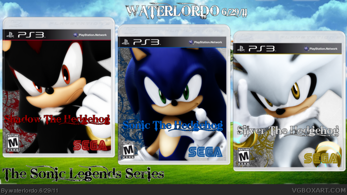
Hello people of VGBA, this is my latest Box: The Sonic Legends Series. The idea popped up when I was running through my old pictures and I ran into a picture of a Previous Version of this box. I decided to "pump it up!" So Enjoy, And tell me what you think!(:
I like it.
However I am confused about the colours of the SEGA logos. It seems the colours represent the eye colour of each character, however shouldn't the logo be green on Sonic's box? If the colours actually represent the colour of their skin/marks, shouldn't Silvers box have a white/silver logo?
The logo style doesn't really work with Sonic the Hedgehog, at least not to my knowledge. It's a pretty standard cover(s), and I think I've seen multiple game editions, each featuring a different character, before.
#2, You make a good point and I didnt think of it that way being of the eye colors lol, but #4 nailed it. #5 I didnt think of that -_- haha. #6 I just wanted to try something different than what everyone else uses and thats kind of what I was going for lol.
These are good and have plenty of potential - just change up the logo to something generally better (offical logos maybe) and I personally think it'll look a ton better. If you decide to do that, just drop me a message and I'll return with a favourite.
#9, Umm, Hi there you troll. Im not gonna fight with you when you have no room to talk, and when I dont even know you. So Goodbye. Have fun trolling other people's boxes that they worked very hard on unlike you.
 The Sonic Legends Series Box Cover Comments
Hello people of VGBA, this is my latest Box: The Sonic Legends Series. The idea popped up when I was running through my old pictures and I ran into a picture of a Previous Version of this box. I decided to "pump it up!" So Enjoy, And tell me what you think!(:
[ Reply ]
I like it.
However I am confused about the colours of the SEGA logos. It seems the colours represent the eye colour of each character, however shouldn't the logo be green on Sonic's box? If the colours actually represent the colour of their skin/marks, shouldn't Silvers box have a white/silver logo?
[ Reply ]
Not really that special. :/
Overused renders and a Gothic font for a logo.
[ Reply ]
#2 I guess white/gray would be to hard to see, so he chose his second color, Gold.
[ Reply ]
#4 What about white/gray with a thin black outline?
[ Reply ]
The logo style doesn't really work with Sonic the Hedgehog, at least not to my knowledge. It's a pretty standard cover(s), and I think I've seen multiple game editions, each featuring a different character, before.
[ Reply ]
#2, You make a good point and I didnt think of it that way being of the eye colors lol, but #4 nailed it. #5 I didnt think of that -_- haha. #6 I just wanted to try something different than what everyone else uses and thats kind of what I was going for lol.
[ Reply ]
These are good and have plenty of potential - just change up the logo to something generally better (offical logos maybe) and I personally think it'll look a ton better. If you decide to do that, just drop me a message and I'll return with a favourite.
Edited at 1 decade ago
[ Reply ]
omg this is retard i hate sonic it is forr fucking 5 year olds !!!!!!!!!!!!!!!!!!!!!!!!!!!!!!!!!
[ Reply ]
#9, Umm, Hi there you troll. Im not gonna fight with you when you have no room to talk, and when I dont even know you. So Goodbye. Have fun trolling other people's boxes that they worked very hard on unlike you.
Edited at 1 decade ago
[ Reply ]